Postmodernism, the Return of Expression >Pop July 17, 2019

“The subject matter of Pop Art is rooted in everyday life; it mirrors contemporary reality and provokes and reflects upon cultural change.”

(Osterwold, n.d.)

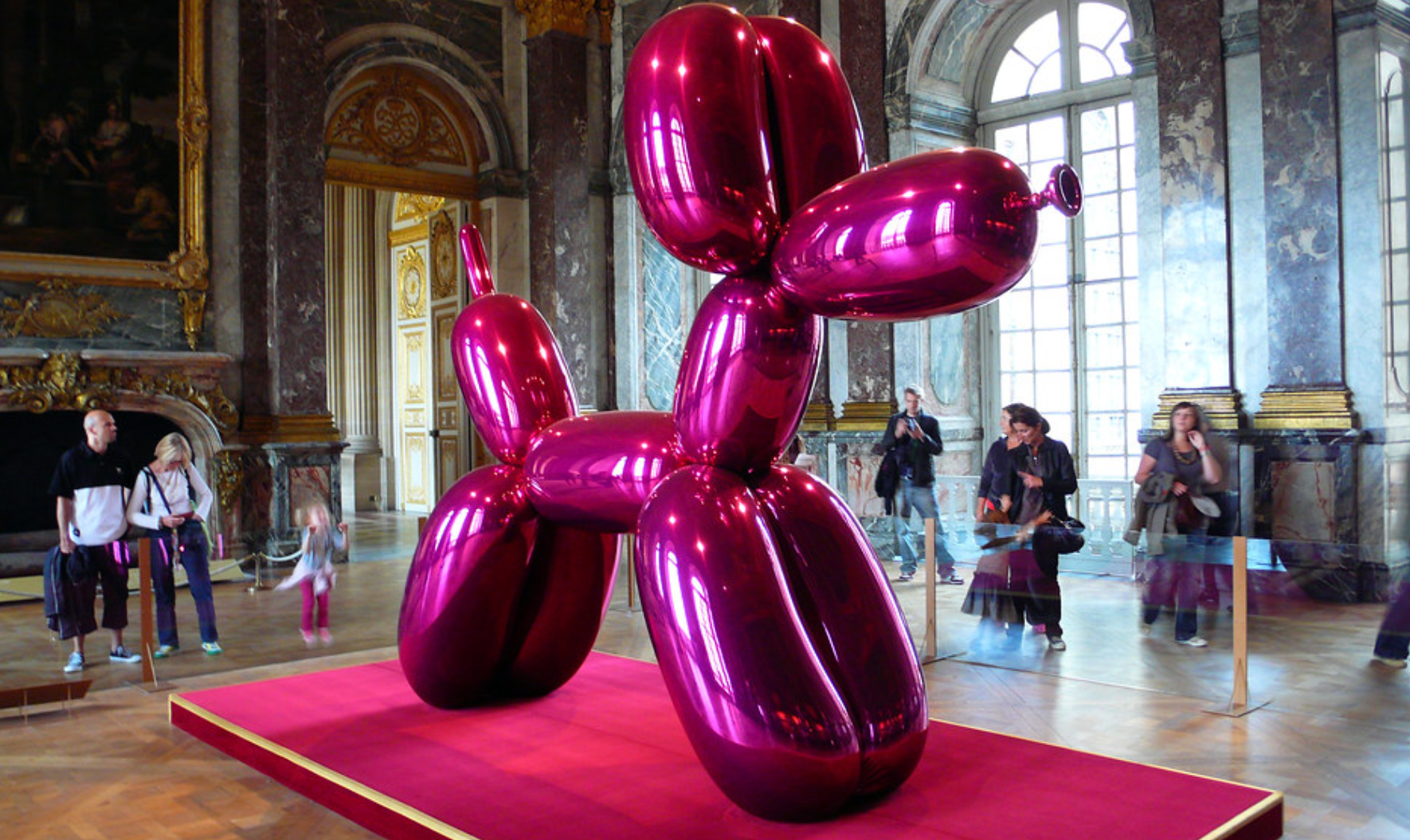
Pop Art continues to have relevance today. The movement is widespread partially because of its nostalgia and also because of its fascinating aesthetics (Kordic, 2015). Contemporary day artist, Jeff Coons, is most known for his popular balloon dogs. Pop artists, like Coons, is known for celebrating everyday objects and popular culture. The balloon animal, typically seen at a child’s birthday party is small and made of one tiny rubber balloon. However, Coons’ take on the balloon art becomes Pop Art because he’s taking this everyday, popular, and well-known object and glorifying it by make it larger than life. His balloon dogs measure in at 307.3 × 363.2 × 114.3 (Kordic, 2015). The movement is widespread partially because of its nostalgia and also because of its fascinating aesthetics (Kordic, 2015). Contemporary day artist, Jeff Coons, is most known for his popular and famous balloon dogs. Pop artists, like Coons, is known for celebrating everyday objects and popular culture. The balloon animal, typically seen at a child’s birthday party is small and made of one tiny rubber balloon. However, Coons’ take on the balloon dog becomes Pop Art because he’s taking this everyday, popularly known object and glorifying it into something larger than life. His balloon dogs measure in at 307.3 × 363.2 × 114.3 cm (Stanska, 2018). They are stainless steel with vibrant color coatings. It may seem ironic, but his infamous pink balloon dog made its way all the way to the Palace of Versailles in France and sparked much controversy as visitors thought it was much too modern and misfitting for the palace of a former king. Sounds like just the rise in society that Pop Art was meant to spark! After all, isn’t any publicity good publicity?

Image result for fun pool floats

“With its bright colors and simple forms, Pop Art projects an innocent child’s view of the world.”

(Paglia, n.d.)

Pop Art is incredibly fun to write about because it is so colorful, often appears larger than life, and reminds us of things we know well by showing them in a new light. It’s 2019 and inflatable pool floats are all the rage. You can float on a slice of pizza, a flamingo, unicorn, donut, or a popsicle. Whatever your guilty pleasure is, you’re actually floating on art! Much like the work of famous pop artist, Andy Warhol, these floats appear childlike and colorful. To me, Warhol saw a normal object such as the soup can and exploited it in his art making it come to life. In the midst of a social media crazed decade, larger than life inflatable food items are becoming incredibly popular. This however; is not a new concept. In the 1960s, Claes Oldenburg used cheap vinyl to stitch giant hamburgers and french fries among other mundane objects like toothpaste. Clearly, the artists of the Pop Art movement saw art and inspiration in everything. Even Andy Warhol was quoted stating, “The world fascinates me. He found everything interesting (Paglia, n.d.).

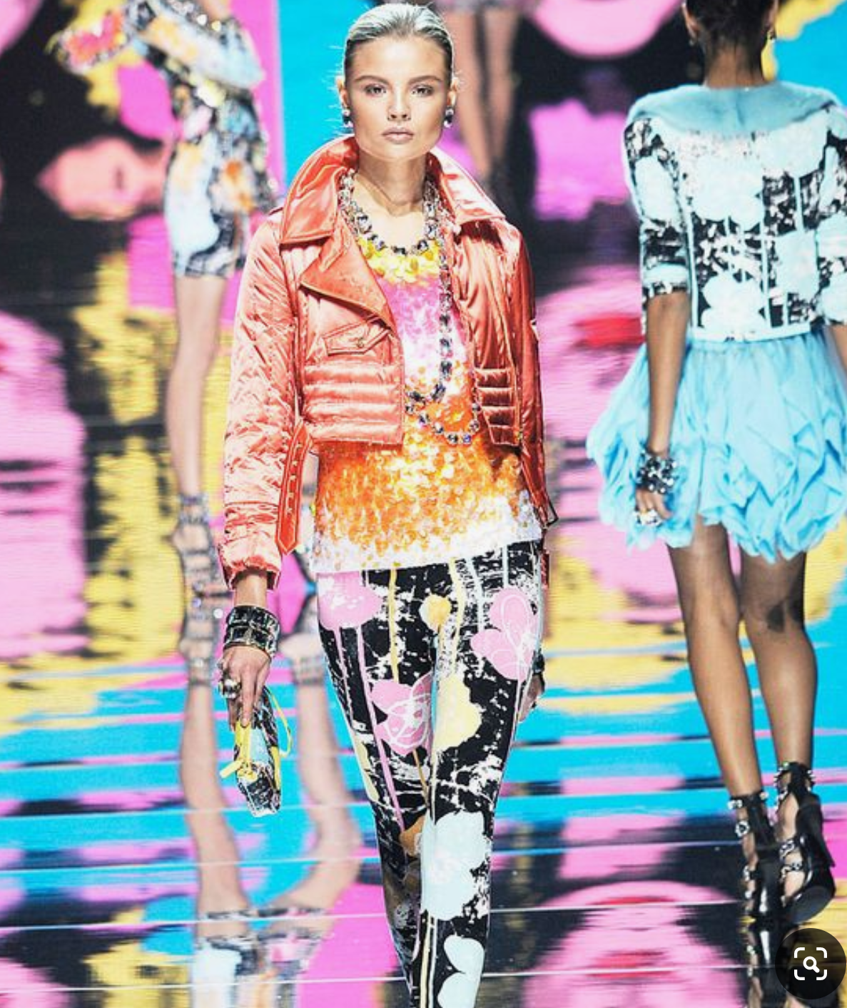
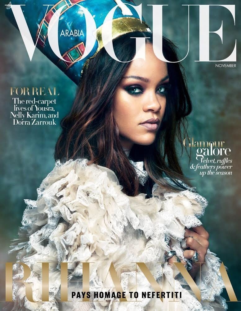
Following WWII, a group of British individuals started British Pop. “They were captivated by the splashy pictorials of American magazines, which conveyed the energy, optimism, and prosperity of the United States” (Paglia, n.d.). It was the 1950s and at the time, Hollywood was trying to compete against the rise of TV. Hollywood was utilizing saturated unreal colors. The colors, fashion, design, and iconic imagery of the time were in fact inspiring Pop Art. The image shown is from Vogue Magazine in today’s times. The models are clearly dressed in the Pop Art style signified by the statement being made through bright, vibrant colored clothing. Rewind to the start of Pop Art, and by 1962 it was gaining heavy media coverage (Paglia, n.d.). I would imagine the fashion world takes risk such as emulating Pop Art to gain media coverage and to get people talking.

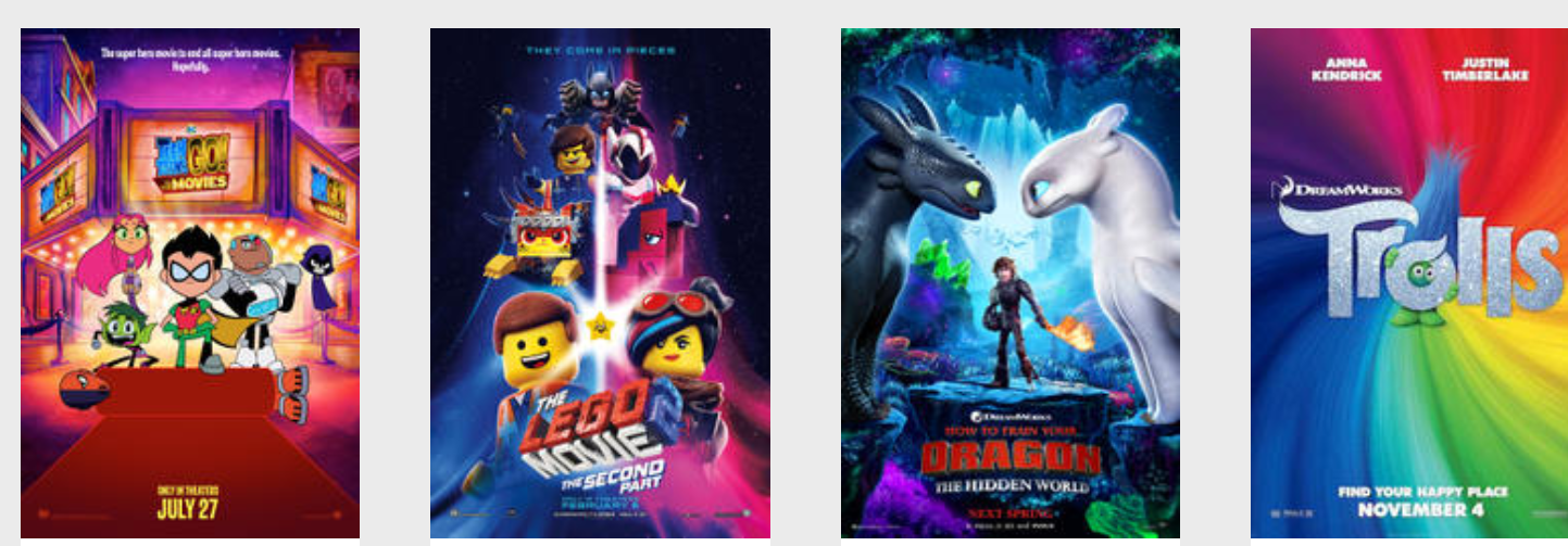
It is incredible to think that the rise of cartooning and animation stemmed from Pop Art. In the 1960s, artists like Roy Lichtenstein and Andy Warhol made paintings based on comic strips recognizing underlying themes of love, myth, and legend (Paglia, n.d.). The public actually responded so enthusiastically to the art that comics started becoming hit TV shows and movies. Think Batman, Wonderwoman, Superman, etc. “Over the following decades, cartooning and animation steadily rose in cultural status, even as the fine arts declined” (Paglia, n.d.). Eventually, computer technology would be introduced changing cartooning and animation forever. Today, many successful blockbuster movies are animated or even star a cast made up entirely of cartoon characters! We can thank Warhol and Lichtenstein for that.

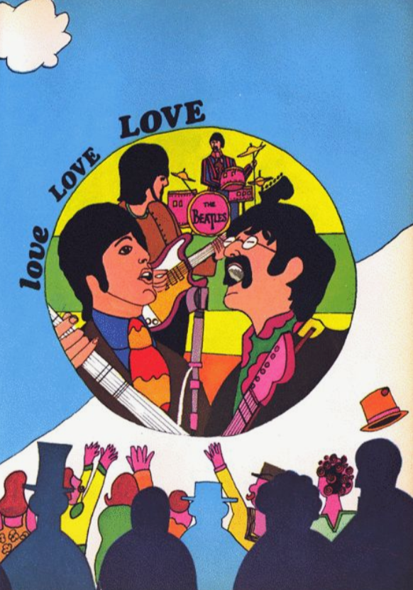
When I think of Pop Art, two images come to mind: Andy Warhol’s soup cans and his colorful depictions of classic icon, Marilyn Monroe. I can make the assumption that album art and fan art in the years to follow would be inspired by this kind of fan art. Take The Beatles, for example. Not only were they known for creating colorful images like the cover of their Sgt. Pepper album, or yellow submarine, but they used type fonts and imagery with Pop Art influences. Even today, fans still create Beatles inspired art in the Pop Art style like this image example shown.

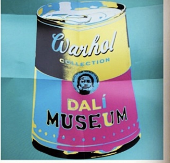
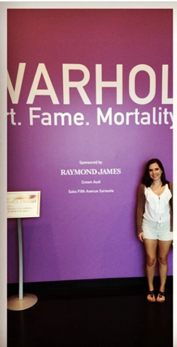
I had the opportunity to visit the Andy Warhol exhibit at the Dali Museum in Tampa, FL in 2014. Here are a couple photos from my experience there:

Sources:

Kordic, A. (2015, November 20). Is it Possible to Answer the Question What is Pop Art in the 21st Century? Retrieved July 17, 2019, from https://www.widewalls.ch/what-is-pop-art/

Osterwold, T., & Galbraith, I. (2015). Pop art. Köln: Taschen.

Paglia, C. (2013). Glittering images: A journey through art from Egypt to Star Wars. New York: Vintage.Stanska, Z. (2018, January 21).

Jeff Koons And His Balloon Dogs. Retrieved July 17, 2019, from https://www.dailyartmagazine.com/jeff-koons-balloon-dog/ Sources:

Revolutions in Design July 14, 2019

Considered an avant-garde novelty, the De Stijl movement was at first treated as outrageous and meaningless (Piper, n.d.). The movement was defined by straight lines, right angles, and color was limited to red, yellow, blue, neutrals, white, black, and grey.

“But in the minds at least of the artists concerned these stark essentials were radiant with symbolic life, and reflected an underlying ideal unity and harmony of the universe.”

(Piper, n.d.)

It was said that the basic facts of nature were discovered through the vertical and horizontal shapes while the primary colors or red, blue, and yellow represented emotions and black and white represented night versus day. I wonder if it just happened this way, or if the artists of the De Stijl movement has planned to use these techniques beforehand and before producing any art. This modern magazine cover encompasses the elements of the De Stijl movement. For example, the straight lines and angles forming geographic shapes and the use of solely red and blue colors. I do think in this specific modern day; however, that the shapes and colors are not meant to represent anything like abstract and geometrical art during the De Stijl movement did. I think the magazine cover’s geometrical red and blue design is meant to artistically compliment the model and their clothing on the cover.

After reading about the Vantongerloo Construction of Volume Relations piece from year 1921 (Piper, n.d.), I saw an unwavering resemblance to the stature and build of a wooden-built game well known to us today, Jenga. In the early 1900s, the art was said to be “balanced with an unarguable finality.” Other words used to describe art during the De Stijl movement were precise and symmetrical. Just like the modern day Jenga game, each piece is a horizontal block formed by wood cut into straight lines. They each align perfectly, symmetrically, and balance when properly weighted. It may be total coincidence that this game was created, but I do believe inspiration in the game’s symmetry and balance could be drawn from aspects of art from the De Stijl movement.

Similar to the game Jenga, which has a harmonious aspect to its design where each piece fits perfectly next to each other, is the game Pac-Man. During the De Stijl period, the use of black and white colors eventually phased out leaving heavy use of the primary colors red, yellow, and blue. Much like Mondrian’s Broadway Boogie Woogie piece (Piper, n.d.), the Pac-Man game is a busy grid made up of those same primary colors. The Broadway Boogie Woogie is inspired by the busy Manhattan street grid. The piece is dizzying and colorful very similar to the busy Pac-Man grid. Pac-Man is an art form. The lines and grids form a perfect puzzling path very much inspired by the complex compositions of the De Stijl period.

“The harmony and order was established through a reduction of elements to pure geometric forms and primary colors.”

(Flask, n.d.)

Constructivism was inspired by Cubism in Paris, and Picasso (Piper, n.d.). Artists visited Picasso in Paris at the time and saw his three-dimensional constructions made up of different materials such as sheet metal, wood, and wire. “A basic concern of Russian Constructivist sculpture was to be the treatment of space rather than of mass. The void was as important as the solid” (Piper, n.d.). This modern-day chandelier is made up of the similar three-dimensional constructions in what looks to be a material similar to sheet metal. Much like artwork at the time of the Constructivist period, the chandelier is geometrically developed and suspects from the ceiling. Each empty space has purpose and creates a shape, and each piece of metal creates a shape, working together harmoniously to form a perfectly geometrical, symmetrical grid.

It is funny how when we look around our house, we don’t necessarily see art in every corner. However, reading about De Stijl and how art is created from geometric perfection and even created by the empty spaces between objects has taught me that art is in fact everywhere. Straight lines, angles, geometric shapes, and empty space exist everywhere and do not change with time. Simply combining these elements creates art. Aesthetic inspiration from art from the early 1900s lives on today within games and even in furniture like this geometric shaped barstool shown. games, to furniture. Resembling Tatlin’s Bent-tube chair from 1923 (Piper, n.d.), this stool incorporates metal and fabric for an innovatory design. “The natural world was translated into a stark pictorial language of shapes, lines, and angles” (Goldstein, 2014).

Sources:

Flask, D. (n.d.). Retrieved from http://www.designishistory.com/1920/de-stijl/

Goldstein, A. M., & Goldstein, A. M. (2014, August 16). What Makes Geometric Abstraction So Exciting? Retrieved from https://www.artspace.com/magazine/art_101/art_market/art_101_geometric_abstraction-5788

Piper, D. (n.d.). De Stijl and Russian Art. In The History of Art II.

Cubism, Art Deco, and Futurism July 14, 2019

Several years ago, I was visiting the Museum of Modern Art, New York (MoMA) and saw this art display or one very similar to it. Let me set the scene. A tour of foreign, non English speaking tourists gathered around this bicycle wheel attached to a stool gripping their audio listening devices staring perplexed at the wheel. I’ve often thought of this since that day. I too, stood staring perplexed at the wheel. What was the artist trying to communicate? What made them thing to affix a bicycle wheel to the stool? Why was this art?

“The Futurists saw this interplay between object and environment, expressed by the Impressionists. They wished, further, to add to this complex relationship between and object and its surroundings the effect on the forms of actual motion in space.”

(Taylor, n.d)

The Futurists awareness of the complexity of perception birthed the concept of dynamism (Taylor, n.d.). They found a connection between the activity of the outside world and the activity of the mind. This way of thinking led Futurists to “put the spectator in the center of the picture.” This brings me back to the bicycle wheel and stool. While we were all gathered around the two affixed objects, we weren’t just spectators, we were part of the art itself. The art display, as Taylor’s article puts it, “made the spectator participate in the complex activity suggested by the forms, colors, and fragments of objects.” I believe that the wheel was meant to show movement. A first for many artists. While many pieces suggested movement, the wheel actually moved.

“Art Deco belongs to a world of luxury and decadence, the Golden Age of the 1920s and 1930s”

(Zaczek, n.d.)

When we think of Art Deco we may think of the classic paintings depicting giant ocean liners, cocktail glasses, moon lit jazz parties, etc. Art Deco; however, did not just apply to paintings depicting this imagery, it applied the same aesthetic to all aspects of design from jewelry design to architecture and interior decoration. Famous to the architectural design world in the late 1800s and early 1900s was architect-designer, Josef Hoffmann (Zaczek, n.d.). He believed that the artist should be involved in every aspect of the architectural design production process down to the smallest details. One of his most famous works in Brussels showed a more holistically designed, geometrically inspired architectural style (Zaczek, n.d.). The image of the buildings he designed in Brussels resembles today’s Art Deco district in Miami, FL. The Art Deco District in Miami is lined with bright buildings standing out in geometric shapes, never losing sight of the aesthetic qualities of the materials used. The result, both in Brussels and Miami, is a building that is “simultaneously functional and exquisitely luxurious” (Zaczek, n.d.).

As mentioned above, Art Deco incorporated its aesthetic influence into everything from architecture to jewelry. In the early 1900s, Art Deco began incorporating stylistic motifs from Ancient Egyptian art (Zaczek, n.d.). The Art Deco Egyptian Revival was referred to as “Nile Style or Tutmania”. While the motif was heavily incorporated in architecture, it was also seen in jewelry inspiration. Turquoise was frequently used in the creation of jewelry, and was a material much associated with the age of the pharaohs. Objects were decorated with motifs such as palm fronds or the scarab beetle inspired by collections of Egyptian art that could be seen in museums at the time (Zaczek, n.d.). Cartier, a modern-day fashion and jewelry designer, created these earrings shown in the example image that include both elements of Art Deco Egyptian Revival: turquoise and the scarab beetle. It is incredible to think that today’s fashion designers draw their inspiration from years past.

This room is a current example of a bedroom furniture set that is for sale at West Elm. The circular table, mirror, headboard, and walnut finish are all elements that represent an Art Deco influence. Art Deco has seemingly defied the passing of time. It’s timeless elements and shapes are aesthetically pleasing to the eye. The biggest design trend of the year might be reviving Art Deco forms. “But unlike the 1920s version, which favored mass production and streamlined geometries, this 21st-century redux — dubbed Neo Deco — places more emphasis on swooping curves, bespoke embellishments, attention to detail and precious materials” (1stDibs, n.d.).

Modern day artist and writer, Brian Andreas, is most known for his line called Story People. With each poem, quote, or saying he draws an image to accompany the words. The images are typically colorful, whimsical, and quite obscure. I’ve actually always wondered what his artistic background is in, and where he draws his inspiration from. In fact, his drawings much resemble the art form, cubism. Artist Robert Delaunay (1885-1941) moved towards abstract art and was concerned with color. He created an Eiffel Tower series in 1910 that demonstrated his grasp of cubism but also his feeling for rhythms and color (Piper, n.d.). Colors created movement and space in his paintings.

“Color is form and subject; it is the sole theme that develops, transforms itself apart from all analysis, psychological or otherwise. Color is a function of itself.”

(Piper, n.d.)

While cubism presented radically fragmented objects, the viewer’s mind still knew what the image was of. Although eyeballs, hands, heads, body shape, etc. were disproportionate and not in realistic colors, we know what it is representing. For example, I see that artist Brian Andreas is drawing people and personifying these colorful objects.

Sources:

Eskilson, S. (2019). Graphic design: A new history. New Haven, CT: Yale University Press.Neo Art Deco. (n.d.). Retrieved from https://www.1stdibs.com/collections/neo-art-deco/

Piper, D. (n.d.). Cubism and Futurism. In The History of Art II.

Taylor, J. C. (n.d.). Futurism. In Futurism.

Zaczek, I. (2003). Essential art deco. Bath: Parragon.

Sachplakat, The First World War, and Dada July 10, 2019

Reading about Das Plakat, a journal championing the collecting of European art posters in the early 1900’s (Eskilson, Schplakat, & Dada, n.d.) instantaneously reminded me of an art poster that used to hang in my room as a teen. Das Plakat was a collectors group covering the poster scene and exploring cultural aesthetic and legal issues about graphic design. They mostly surveyed significant German and international work, addressing themes such as originality, plagiarism, and politics (Eskilson, Schplakat, & Dada, n.d.). I happen to know the plot of the musical Cabaret, the musical in which the poster shown above represents, and that it takes place in Berlin, Germany post World War I. This was a time when the Nazi Party was on the rise. This poster touches on similar artistic and culture aspects to those that Das Plakat studies in the early 1900’s. For example, note the Nazi flag waving in the background behind character, Sally Bowles. The poster tells a story and due to the background imagery showing Germany post WWI, it is time stamped, historical, political, and powerful. Das Plakat was the invention of Hans Josef Sachs (Eskilson, Schplakat, & Dada, n.d.).

“Without Sachs’s dedication, German commercial art would have developed anyway, but as editor of Das Plakat he almost single-handedly promoted German Gebrauchsgraphik (commercial art) into an internationally respected applied artform.”

(Eskilson, Schplakat, & Dada, n.d.)

Continuing the conversation on Das Plakat, I cannot think of any group that is similar today or still in existence. It fascinates me that Sachs was a chemist by trade, dentist by profession, yet became the largest poster collector in Germany (Eskilson, Schplakat, & Dada, n.d.). “As a teenager he was obsessed with collecting French posters, and in his twenties became the leading private collector in Germany, with thousands of acquisitions.” He was only 24 years old and built a national organization and board of directors in support of poster art. Fast forward to today, and certain art posters have become iconic and timeless. Take the Chat Noir poster, for example. Translating to “black cat”, the Chat Noir was a famous cabaret venue in the 1800’s. Known for its atmosphere of creativity, innovation, and improvisation, it became a place for Parisians to gather (1stDibs, n.d.). Again, we see the same underlying social and political themes that Das Plakat surveyed appear in what the Chat Noir poster actually represents. Similar to the Cabaret poster, the Chat Noir poster is also a historical time piece representing a time of artistic freedom, creativity, and a place where politics and ideals could be openly discussed. There is so much more represented behind just the art in these posters. The art was a vehicle to communicate history and political messages.

“It was not just a place to be entertained, but a place for socializing, the discussion of politics and ideals, and a place of excesses and rule breaking. The Chat Noir set the bar for the cabaret in Paris and throughout the world.”

(1stDibs, n.d.)

With just a quick internet search, I was able to locate dozens of modern art examples of still life. Giorgio Morandi was associated with the Metaphysical school and lived from 1890-1964 (Piper & Dadais, n.d.). His work was similar to this example shown in that his still life paintings were well-defined but were not portrayed according to realistic expectations. For example, illogical structures were presented or shadows that did not exist in real life were painted (Piper & Dadais, n.d.). Much like this example above, the viewer of the art knows this is a still life of vases; however, the shapes have a bit of creative stretch to them and colors are obviously far from realistic.

If you’ve read any political news or watched the news on the television lately, then you may recognize this image. Artist Dada, who began making waves with his art around the time of WWI, created images the world had never seen before. Dadaists were said to be “repulsed by self-styled enlightened societies that fawned over pretty paintings while dispatching youths by the millions to their deaths” (Levitch, n.d.). The article on Dadaists also explains their goal of art which was to compel people to confront life’s ugly realities. While we might not look at the picture shown above and think that it is “art”, it is still communicating an important message, which was what Dadaists believed in. Ultimately, art is meant to communicate a feeling, meaning, metaphor, or message to a view. So whether that feeling is pleasant or not, this photograph above is still accomplishing something that makes it “art”. It is making society dig deeper into their feelings to consider the political and social climate that exists today.

Today, we see so many reproductions of famous paintings that we almost don’t think anything of it at all. When we see a funny piece of art mocking an original famous piece, we recognize the piece it is mocking but do not consider there was actually an artist who did this first. I found much humor in the reading speaking of artist, Dada, and the anti-masterpiece.

“Dadaists found oil paintings pretentious, and they ridiculed art history’s elite.”

(Levitch, n.d.)

Dadas continued his many attacks against fine art. Even by adding a mustache to the famous Mona Lisa painting much like the example shown above mocking Leonardo DaVinci’s famous painting by depicting it similarly, but in a humorous way tweaking the appearance of the characters in the image.

Sources:

Eskilson, S. (2019). Graphic design: A new history. New Haven, CT: Yale University Press.

Heller, S. (1999). Design literacy (continued): Understanding graphic design. New York: Allworth Press.

Levitch, M. (n.d.). Dada Student Guide: National Gallery of Art.

Original 1896 Chat Noir Poster by Steinlen for the Black Cat French Cabaret. (n.d.). Retrieved from https://www.1stdibs.com/furniture/wall-decorations/posters/original-1896-chat-noir-poster-steinlen-black-cat-french-cabaret/id-f_4326123/

Journal Entry 2: Romantic Period, 19th century illustration, & 19th century typography July 7, 2019

Released in 2008, the band Coldplay’s album cover displayed the scene of a vintage French battleground similar to those depicted in art of the Romantic Period. The movement, stemming from the term meaning “romance like”, characterized revolt and self-expression (Gardner, Kleiner, & Wadsworth, n.d.). As literary taste and art changed in France and Germany by the late 18th century, war and stress were on the minds of the people making the future look less optimistic which left a feeling of concern for the population at the time (Gardner, Kleiner, & Wadsworth, n.d.). It seems ironic to me that this movement and time period coined the term Romantic Period. When I hear the phrase romantic, I would think a beautiful, pleasant, loving time. The Romantic Period; however, seemed to be quite the opposite. Theodore Gericault was a French artist closely associated with the Romantic movement (The Romantic Period, n.d.). He depicted historical events that showcased drama and emotion. The Coldplay album cover showcases similar emotions and themes.

Reading about Honore Daumier, political caricaturist of the nineteenth century, immediately reminded me of political themed Time magazine covers from today’s times. Best known for his caricature work for the popular press, Daumier’s paintings and drawings portrayed art and history as being inseparable and his style was tied to political and social responsibilities (Gardner, Kleiner, & Wadsworth, n.d.). I found it fascinating, and incredibly sad, that during the nineteenth century caricature became subject to censorship and editors and illustrators were imprisoned for its publication, before the caricature was banned altogether in 1835 (Gardner, Kleiner, & Wadsworth, n.d.). French rule recognized that caricatures could convey powerful messaging to everyone including those who were illiterate. Time magazine’s cover images are symbolic in today’s popular culture. I think that many adults could name at least one Time magazine cover off the top of their head that they can recall seeing because the images are so powerful and memorable in our society. Historically speaking, Time magazine has seemed to take artistic risks, like the example cover shown above, with their political and social satire covers. Time Magazine is aware of their cultural impact and utilizes their platform, or in this case, an 8 X 10 space to artistically represent powerful social messages. D.W. Pine, Time’s Creative Director said, “The cover of Time crystallizes what’s important in a simple, graphic, impactful 8-by-10 space – and it’s that curation that is powerful in a day where most, if not all, of our visuals are presented in an instant and gone tomorrow” (Patterson, 2019).

Reading about camera arts made me think about how we take so much of what we have today for granted. I did not grow up with a smart phone like most kids nowadays do; however, they became very popular in my lifetime and a large portion of my generation uses their smartphone as a camera to document their every move. Looking at the sketches of the camera obscura, a large box which projected a picture from outside into the box through a hole that let light in, it would be hard to imagine that one day, many years into the future, people would have a small device that fit in their pockets that could capture high-quality images anywhere and anytime. The major setback to the camera obscura was that it could capture images, but not preserve them (Sayre, n.d.). The example shown is of a potential landscape image a smartphone has the capability to capture. The camera obscura was the start of many different forms of capturing images which would eventually lead to the photography capabilities we have today. Later, the calotype was created which was the basis of modern photography (Sayre, n.d.). The calotype allowed artists to take a picture and capture the world as is, just as we do in today’s photos. The photograph is incredibly important in historical documentation and storytelling and something that I believe will always be used in society and in art.

William Henry Fox Talbot created a new process for preserving photos and images in England in the early 1800’s. The new process was called photogenic drawing, a process which fixed negative images onto a paper coated with light-sensitive chemicals (Sayre, n.d.). Talbots collection of photogenic drawings included one called Mimosoidea Suchas, Acacia, which was the imprint of a large leaf. We see very similar art on the shelves of home furnishing stores today. The example shown above, for example, is currently for sale at Pottery Barn. Whether intentional or not, much of today’s photographs and art, look incredibly similar to photogenic drawings of the early 1800’s.

To the right is a portrait photograph taken of modern musician and artist, Kanye West. In 1862, the French government gave portrait photography the legal status of art due to its ability to expose the “soult” of the sitter. (Sayre, n.d.). Portait photography also served as a way to document important persons and events. Similar to how we utilize portrait photography today. Business use portraits on their websites to identify key company leaders and portraits are taken often of celebrities to document fashion and moments in their careers. Think about it, every year at school children even get their portrait taken to document their age, time, and place. This gives parents history to look back on, a photo from each year of their child’s life. In the reading, I read about Julia Margaret Cameron who was said to be one of the greatest portrait photographers of all time. She wrote,

“When I have had such men before my camera, my whole soul has endeavored to do its duty towards them in recording faithfully the greatness of the inner man as well as the features of the outer man.”

-Julia Margaret Cameron (Sayre, n.d.)

I believe the portrait photo of Kanye West accomplished not only showing his outer appearance, but it includes an element of emotion showing a glimpse into his personality.

Sources:

Gardner, Kleiner, F. S., & Wadsworth. (n.d.). Europe and America, 1800 to 1870. In Art Through the Ages.

Patterson, Jessica. “Behind Time Magazine Covers: a Q&A with DW Pine.” Fipp.com, 14 Jan. 2019, http://www.fipp.com/news/features/behind-time-magazine-covers.

Sayre, Henry M. “The Camera Arts.” A World of Art.

Cave Paintings, Egyptian Art, Illuminated Manuscripts, or Early Typography, etc. July 3, 2019

The shapes and forms of Roman serifs defied mathematical analysis or geometrical construction (Alphabets, n.d.).  This thought certainly drew me to a piece of art that sits in my own home.  With the texture of paper mache and shiplap, this piece is what in today’s world we consider modern art; however, it contains elements that date back to 190 BCE.  I wonder, was the artist, in fact, inspired by the early Latin alphabet, or has art evolved from that point in time keeping some of its most sacred and early elements?  Typography has changed a lot through the years, but it always existed.  In the 1960’s, letters began to look more dynamic and psychedelic.  Then, in the 80’s, typesetters stored electronic data and futuristic and colorful letters were used in art and public displays (Smirna, 2017).  So, like the fashion world where old trends come back in style (I bought a pair of bell-bottom jeans this year), has ancient typography come back in style?  Is the art in my home inspired by early Latin lettering?  To the modern-day human being, ancient Latin letters just appear to be meaningless shapes, but to the people of that time period, it was their language.  It was their expression.  Is there more behind today’s paper mache and shiplap modern-art?  Is there meaning? 

“I would venture to warn against too great intimacy with artists as it is very seductive and a little dangerous.”

-Queen Victoria

The term Victorian design was coined by Queen Victoria herself and became popular in the later half of the 19th century (Ryan & Conover, n.d.). Victorian style text was found in paintings, architecture, print, furniture, and typography. The Victorian style was said to be eclectic, but timeless and still popular today. Enter, wine bottle. I’ve always admired Michael David’s Freakshow wine bottle on the shelf. I would describe the bottle as whimsical, but I never knew the writing on the bottle’s label was actually Victorian inspired typography. The reading, Connecting Past Legacies, talks about a piece of art titled, “El Circo”, which is doubly influenced: a Victorian typesetting paired with a circus design (Ryan & Conover, n.d.). The Freakshow wine label has the same combination of circus theme and Victorian typesetting influence. The label communicates to wine enthusiasts who are looking for an experience. The label is the first impression, not the taste. The artwork makes a statement that this bottle of wine is something classic, yet it has a whimsical twist. A story in a bottle expressed through the art on the label.

In 2017, singer Rihanna graced the cover of Vogue Arabia in none other than a traditional Egyptian inspired look. Around 1500 BC, the Egyptians evolved their hieroglyphics . Much progress was made at that time going from cave drawings to symbols that represented thoughts or ideas (Ryan & Conover, n.d.). Rihanna’s traditional Egyptian style hat on this vogue cover is recognizable and symbolic dating back to the times of evolving hieroglyphics. Ancient hieroglyphics were said to grace jewelry, architecture, tools, artifacts and more. Today, we are quite the opposite. Rather than engraving tools or artifacts with symbols that were often shown in hieroglyphics, we wear the symbols and create Egyptian inspired art and history with our fashion.

If you’ve been to a home decor store or shopped for home decor online recently, then you may have undoubtedly noticed that pictures of cows, moose, and buffalo are quite in style.

“Prehistoric cave paintings are the earliest examples of human communication available to us and perhaps mark the first emerging of fine and applied art.”

(Ryan and Conover, n.d.)

When I think of early cave paintings, I think of animal figures, human figures, hunters, and storytelling in a progression through imagery. Fast forward to 2019, add computer design, photography, and printers, and there you have modern day cave art. For sale as in-style art for your home! Like traditional cave paintings, this example of modern buffalo art also tells a story. The buffalo is isolated in the frame, standing in a cold climate, and confronting the viewer of the art head on. The art speaks to the animal’s strength and a buyer may purchase the art because they relate to the strength, isolation, and confrontation the art displays. Strength, isolation, and confrontation are not new ideas though. These feelings existed in the times of cave paintings. Cave stories very well could have provoked the same emotion that a buyer in West Elm feels today looking at art like this buffalo example shown.

We’ve become accustomed to seeing fairytales and even Disney movies begin by showing a scene of the first page of an old book slowly flipping open. Typically, on that page is a large first initial followed by smaller text like the page example shown above. What we fail to realize is this isn’t a playful design element created by Disney, but one of ancient Celtic book design. The large first initial actually caused design challenge for Monks. Who would have thought, monks sitting around being challenged by artistic design! However, they found a solution called diminuendo, which means to decrease the scale of graphic information (Illuminated Manuscripts, n.d.). Some modern day books, like Robin Hood shown above, are created to resemble ancient books and art. For example, the reading, Illuminated Manuscripts, talks about The Book of Durrow using a large first initial as the page design scheme. Looking at the cover example of that book immediately reminded me of modern day fairytales and Disney books. The designs on ancient Celtic book covers were crafted by a blend of dots, swirls, shapes, and color very similar to what we see today on book covers trying to emulate that ancient feel. Fairytales are timeless and so are the elements of Celtic book design.

Sources:

Illuminated Manuscripts. (n.d.). Religion Past and Present. doi:10.1163/1877-5888_rpp_com_09316

Ryan, W. E., & Conover, T. E. (2004). Graphic communications today. Clifton Park, NY: Thomson/Delmar Learning.

The History of Typography and its Journey Through Art. (n.d.). Retrieved from https://www.widewalls.ch/typography-history-art/

The Latin Alphabet. (n.d.). Alphabets, 31. Retrieved July 3, 2019.

Design a site like this with WordPress.com
Get started