A vision statement expresses the innovation intent and its realization in a minimum set of words or visuals (Kumar, 2016). The vision statement helps communicate the innovation to stakeholders and customers. Rebecca Geier, a brand strategist, wrote, “Done right, vision statements can provide alignment and direction across the enterprise and inspiration for all employees and stakeholders” (Geier, n.d.).
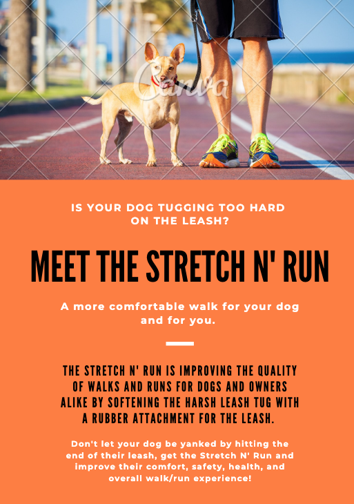
The below graphic illustrates my product title, supporting phrase, a short description of the challenges and solutions, and illustration of the key benefits. The graphic is a continuation of the product I developed for Critical Essay 6, the Stretch N’ Run dog leash attachment.
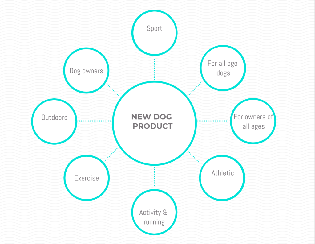
The target customer is all dog owners, whether they have a dog who walks and pulls on the leash, a fast dog who hits the slack on their leash end too hard, or someone who jobs or exercises with their dog. I see how hard the leash tugs at my dog when he hits the end of the leash slack and I think a simple, heavy-duty rubber attachment will make that tug less harsh and more comfortable experience for both the dog and the owner. The vision for this product comes from real-life inspiration and aiming to better the leash experience for dogs and owners alike.
Vision statement: The Stretch N’ Run aims to improve the quality of walks and runs for dogs and owners alike by softening the harsh leash tug with a rubber attachment for the leash.
One article on crafting a product vision statement suggested referencing your customer in your vision statement as a best practice.
“Your customers are the whole reason for your product. If you don’t reference them in your product vision, you need to rework it.”
Monty Mitra, 2019
Without serving the customer, the product won’t succeed. I agree that this is important to the product’s vision and overall success.
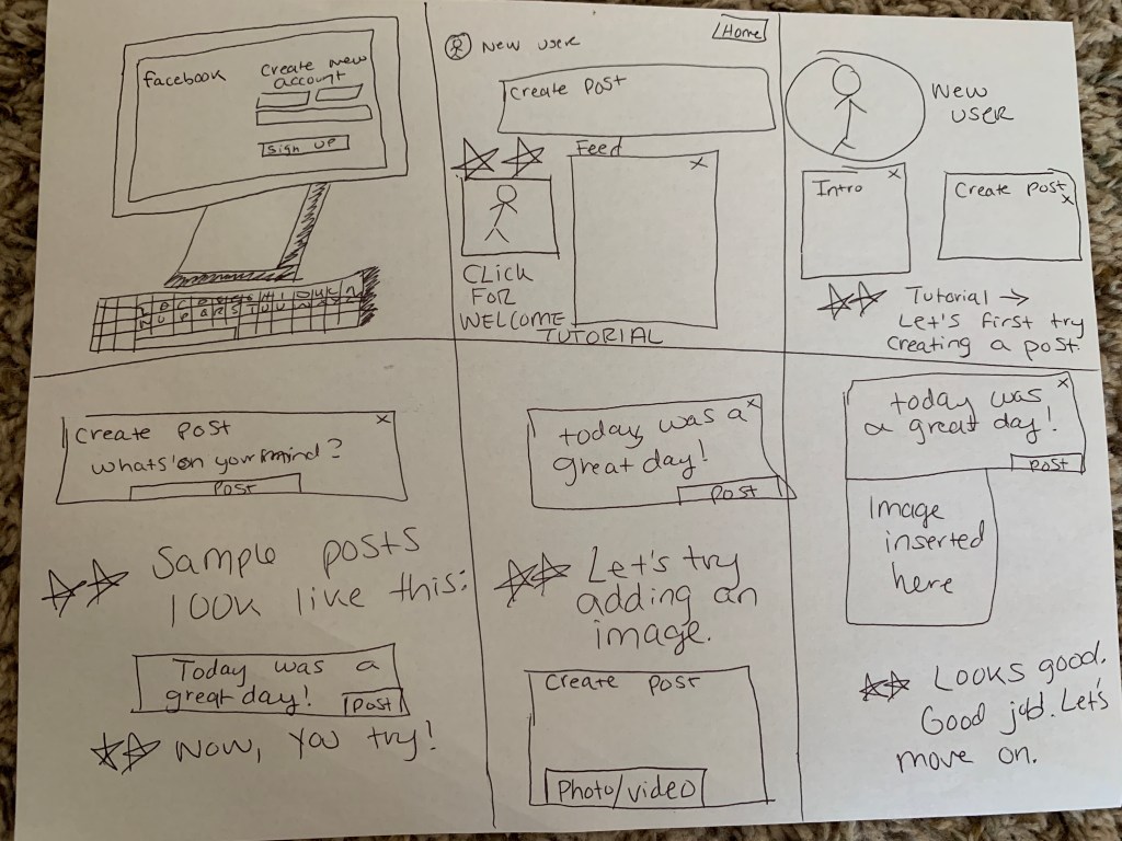
A solution storyboard is a set of sketches arranged in sequence outlining the scenes of a story describing how all the parts of the concept system work together in situations (Kumar, 2016).
Below, I will illustrate a storyboard solution for Facebook. Recently, I have watched my father (who is on the older end of the baby boomer generation) create a Facebook profile and begin learning how to use the app. For him, many of the concepts of Facebook are not innate as they seem for kids who grow up with the technology nowadays. I have had to answer many questions for him and help him navigate the app. The problem? Facebook does not seem to offer new users a tutorial walkthrough of how to use the basics of your profile, nor provide beginner self-help tutorial videos. The solution: New Facebook users will have the option upon creating a profile to be walked through a digital tutorial and given a link to other videos they can watch to help them understand the basics of Facebook, settings, etc.
According to a recent study by Herosmyth, only 26% of internet-using baby boomers say they feel very confident when using electronic devices to do the things they need to do online (Crawford, n.d.). And according to the same study, Facebook is the most popular platform across all generations, which is why it is so important that Facebook offers users of all levels, beginner through advanced, the opportunity to better use and understand the platform.
Image Source: Wall Street Journal
While not all solutions lend themselves to a storyboard, this one does because the steps of a tutorial are easily laid out in a functional order that lends itself naturally to a storyboard.
“The storyboard serves as your final opportunity to review your concept and make any changes before production happens.”
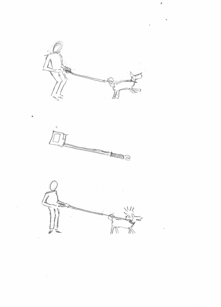
The new product I am creating is for a dog and it is a rubber attachment for the end of a leash. I am going to name my product the Stretch N’ Run, Hydraulics for your dog leash. As far as I know, a leash does not currently exist that has a rubber attachment at the end to prevent a harsh tug against the dog when they hit the end of the leash. I know from experience that my dog is an incredibly fast runner and I have to sprint to keep up. I see how hard the leash tugs at him when he hits the end of the leash slack and I think a simple, heavy-duty rubber attachment will make that tug less harsh and a more comfortable experience for both the dog and the owner.
The below concept sketches illustrate a dog owner running with their dog using a normal leash, and then the same thing but using the Stretch N’ Run leash attachment. The dog is more comfortable with the attachment as illustrated, and the owner is happier that their dog is having a more positive leash experience. It is said that the concept sketches will often spark ideas for further explanation (Kumar, 2016). The sketch illustrates a non-retractable leash; however, it will be beneficial to sketch out both leashes in order to find any difficulties with the product and development ahead of time.
The below opportunity mind map illustrates my thought process surrounding the reasons a customer might purchase this product and what type of consumer would be targeted. The mind map is used at the beginning of exploring a concept and allows the creator to see where there is a potential opportunity (Kumar, 2016).
In business, partnership is important. In the development of my product, I might want to partner with current leash products to offer them this new attachment. Forbes wrote, “A value hypothesis should be a testable statement that can be validated or refuted when facing your prospective partner” (Pollack, n.d.).
My value hypothesis = By adding the Stretch N’ Run attachment to a normal or retractable leash by partnering in distribution with X leash company, annual sales will increase by $1.2 million based on a cost report analysis of company X.
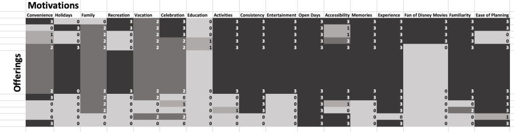
An asymmetric clustering matrix helps build an understanding of the offerings vs. value of something by comparing the elements of one list to another (Kumar, 2016). I’ve created the below asymmetric matrix to understand the relationship between the offerings and value of Walt Disney World in Orlando, FL. Disney World has continued to raise its prices, but the question is:
“Are they also increasing value in addition to the rising prices?”
An article in The Washington Post stated, “For America’s middle-income vacationers, the Mickey Mouse club, long promoted as “made for you and me,” seems increasingly made for someone else. But far from easing back, the theme-park giant’s prices are expected to climb even more through a surge-pricing system that could value a summer’s day of rides and lines at $125” (Harwell, n.d.).
I created the below asymmetric matrix using a scoring scale system to measure the relationship between the offerings and visitor motivations Walt Disney World. 0=no relation, 1=minimum relation, 2=medium relation, and 3=maximum relation.
(Below matrix is also attached to assignment submission for larger view).
Based on the reading’s recommendation of sorting the matrix to reveal the rows or columns that have similar scores, it is evident that activities, consistency, entertainment, open days, accessibility, memories, experience, and ease of planning all relate the highest to the offerings of Walt Disney World.
“We continually add new experiences, and many of our guests select multi-day tickets or annual passes, which provide great value and additional savings.”
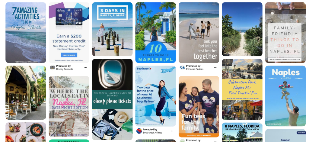
Image Sorting is a method used to find out peoples’ associations and perceptions of particular topics (Kumar, 2016). The discussions that the images initiate reveals emotions, perceptions, thoughts, and values. For example, two people may look at the same image and have completely separate thoughts. One person may associate that image with something opposite of the other person. Taking a non-traditional approach, design researchers might use image sorting is to spark story-telling (Olsen-Landis, 2017).
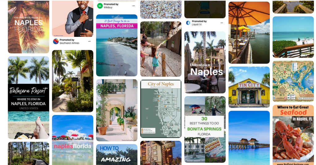
I chose to conduct a digital image sorting session with a couple of my friends via Skype. As seen below, I used a Pinterest board of Naples, FL to gather my 30 images based on the theme of our well-known town nearby, Naples, FL.
In this research experiment, I will call my two friends individuals A and B. Individual A had a very literal approach. They saw a photo of a Disney credit card and associated it to a family wearing Mickey Tees, seashells and associated it to a father and daughter at the beach, and the plates and associated the image to what appears to be a restaurant. Additionally, they associated the airplane to the image that portrayed logo of Southwest airlines. In these associations, the relationship is self-explanatory. When asked why they sorted the images the way they did, individual A said, “These items make sense to go together because they are of the same topic or idea. It makes sense to pair them with their closest related topic.
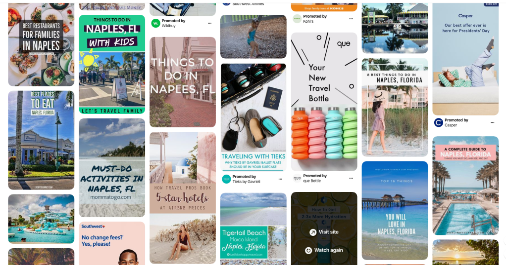
Individual B had a less literal approach to sorting the images. They paired the airplane image to the beach, the playground picture to the water, and the person walking with the restaurant. Individual B explained that they paired the airplane image to the beach because it is a method of travel to get to the beach and someone might jump on a plane to take a vacation in Naples, FL. The playground picture was paired with the water photo because they are both activities and things to do/places to go to. And finally, the person walking on the beach was paired to the restaurant because someone may walk to dinner.
To me, Individual B’s method of sorting the image told much more of a story than individual A’s method. Individual B’s method allowed me to envision what a person might do in Naples and the places they would go and how they would get to them.
As our reading states, “This exercise sparks a conversation about abstract ideas and feeling that otherwise may remain undetected in a traditional Ethnographic Interview” (Kumar, 2016).
References:
Kumar, Vijay. 101 Design Methods: A Structured Approach for Driving Innovation in Your Organization.. [Vault eBooks].
I have been using Sun Basket for several years now. They are a certified organic handler meal delivery company. Sun Basket provides organic produce, hormone & antibiotic free meats, and clean ingredients in their boxes to allow their customers to cook a variety of flavorful meals. Sun Basket’s intent is to provide full flavor, sustainable, and quality ingredients to create a variety of meals for their customers.
For innovation to be successful, it must be married to a company’s strategy. Successful innovation can provide a unique direction for the company that will generate specific short-term and long-term value targets (DeSai, n.d.). In our textbook, 101 Design Methods, they use the example of Nike in referring to innovation. Nike didn’t just focus on creating a better shoe, they created a better athletic experience. Kumar said, “Beyond innovations in materials, aesthetics, and performance, the company has developed innovations that extend the runner’s experience” (Kumar, 2013). Sun Basket follows this same method. They not only aimed to provide better ingredients and offerings to their customers, but to provide a new and improved in-kitchen experience.
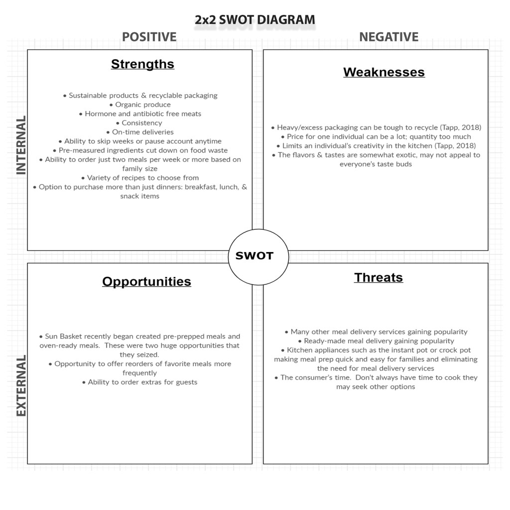
(SWOT ANALYSIS WRITTEN OUT BELOW IN LARGER FONT SIZE FOR READABILITY)
STRENGTHS:
Sustainable products & recyclable packaging
Organic produce
Hormone and antibiotic free meats
Consistency
On-time deliveries
Ability to skip weeks or pause account anytime
Pre-measured ingredients cut down on food waste
Ability to order just two meals per week or more based on family size
Variety of recipes to choose from
Option to purchase more than just dinners: breakfast, lunch, & snack items
WEAKNESSES:
Heavy/excess packaging can be tough to recycle (Tapp, 2018)
Price for one individual can be a lot; quantity too much
Limits an individual’s creativity in the kitchen (Tapp, 2018)
The flavors & tastes are somewhat exotic, may not appeal to everyone’s taste buds
OPPORTUNITIES:
Sun Basket recently began created pre-prepped meals and oven-ready meals. These were two huge opportunities that they seized.
Opportunity to offer reorders of favorite meals more frequently
Ability to order extras for guests
THREATS:
Many other meal delivery services gaining popularity
Ready-made meal delivery gaining popularity
Kitchen appliances such as the instant pot or crock pot making meal prep quick and easy for families and eliminating the need for meal delivery services
The consumer’s time. Don’t always have time to cook they may seek other options
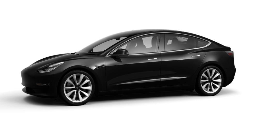
The product I am choosing to analyze is the Tesla, electric car.
Using the discovery method, what observations and analysis can be concluded on your product or service? Discovery is the knowledge building phase of the design method (Karjaluoto, 2014). Discovery is an important step in the design method because it allows the designer to immerse themselves in the project, understanding the consumer needs, the market, the company, and all other aspects of their client. Using the discovery method, the first thing I did was find the client (Tesla’s) website. It is clear to see that design is important to Tesla. The website has minimal pages and tabs and focuses mostly on imagery. The site even allows customers to build their own car, which is highly focused on the design form and appearance. On their website, Tesla wrote, “Tesla was founded in 2003 by a group of engineers who wanted to prove that people didn’t need to compromise to drive electric” (Tesla, 2020). From this statement, I can assume that Tesla engineers focused on both form and function when building the Tesla. Using the discovery method, I also find that the typical Tesla customer has an average credit score of 740 and is about 54 years of age (Fortuna, 2019). It is unclear to me if Tesla customers purchase the vehicle mostly in part due to its energy efficiency, or if they purchase the car as a status piece.
What are the key issues? In 2019, the biggest problems reported to Bloomberg were paint issues, panel gaps, scratches, and dents (Matousek, 2019). These are all key elements of the car’s design.
What design direction did your product or service take? It is no secret that the Tesla is the best looking of the electric cars available on the market. The designer of the Tesla, Von Holzhausen, was educated at one of the world’s most prestigious transportation design programs. The direction that the product took is a sleek and sexy design and world-class design competency.
“Von Holzhausen gets to envision the future on its own terms — gorgeous electric cars that will someday be able to drive themselves. The car designer of the coming decades might admire the legends of the profession’s history (and there have been many). But when it comes to crafting a career and a reputation, they will look to Holzhausen.”
The Business Insider, DeBord, 2017
Where has the creative been implemented and evaluate its effectiveness?The creative was implemented from the get-go when Holzhausen signed on as the primary designer of the Tesla. Tesla accomplished the mission of creating a trendsetting vehicle, resetting the consumer’s expectation of what an electric car should look like. It has proved to be effective because Tesla has since expanded their product line and continues to gain consumers.
Where is the trend going? Recently, Tesla launched their most affordable car yet, the Model 3. This not only brings the sleek, recognizable design to a whole other market of consumers, but helps the company accomplish their mission of creating energy efficiency for a more sustainable planet. It seems the possibilities and future are endless for founder, Elon Musk.
What is the intent statement for this product or service?
“Tesla’s mission is to accelerate the world’s transition to sustainable energy.”
Karjaluoto, Eric. Design Method, The: A Philosophy and Process for Functional Visual Communication. [Vault eBooks]. Retrieved from https://www.vaultebooks.com/#/books/9780133438949/
Design is defined as a plan or drawing produced to show the look and function or workings of a building, garment, or another object before it is built or made. According to form vs. function, the definition of design contradicts stances that several articles have taken on form and function. The design may not be able to accomplish showing both the look, or form, and function of something. Take, for example, the iPod which proves that in design, the function is more important.
In a New York Times article, ‘The Demise of Form Follows Function’, author Alice Rawsthorn wrote, “How could you be expected to guess what that tiny metal box does by looking at it? There are no clues to suggest that it might play music. Like most other digital devices, the Shuffle is (literally) an inscrutable box of tricks” (2009).
While the iPod looks simplistic, Apple was purposeful in their design solutions addressing both form and function, but mostly function. They managed to create a form that is sleek, simple, and small, while still serving multiple functions. The iPod’s function outweighs its form when it comes to design. Apple was purposeful in creating something that accomplished a great goal with its function. How did they accomplish this? By keeping the form of their design sleek and portable, it allowed them to accomplish the goal of creating an item that is highly functional, yet portable.
Systems thinking allows an individual to look at all items of a whole, rather than just one part of the design process (Karjaluoto, 2014). As a designer, it is important to assess the goals of the design project. For example, who is the design for? What is its purpose? There may be specific requests from a client or brand guidelines that need to be met. Or perhaps, the design is aiming to accomplish a rebrand or realign a brand to its mission through imagery. Whatever the purpose, systems thinking allows the designer to focus on the goals of the project and meet them through the creative process.
Innovation is defined as a viable offering that is new to a specific context and time, creating user and provider value (Kumar, 2013).
Companies like Apple come to mind when it comes to innovation. Take, again, the iPod, for example, or even the iPad. These were created intentionally to be simplistic in design, yet robust in function which provides a lot of value on the user end.
In conclusion, innovation and systems are both crucial pieces of the design process. Design is not just about creativity and appearance; it is about function as well. Function, in the case of technology, has proved to be the most important aspect of the design process. Technologically designed items have specific goals to meet to provide users with value.
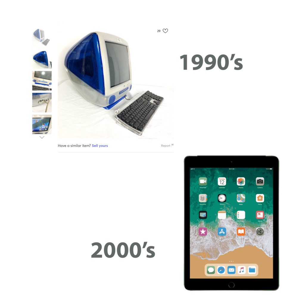
The informational graphic example is given shows one of the early Apple desktop computer models in the 1900’s. The other image is an iPad from modern-day times.
While both have similar functions, their form has drastically evolved in time.
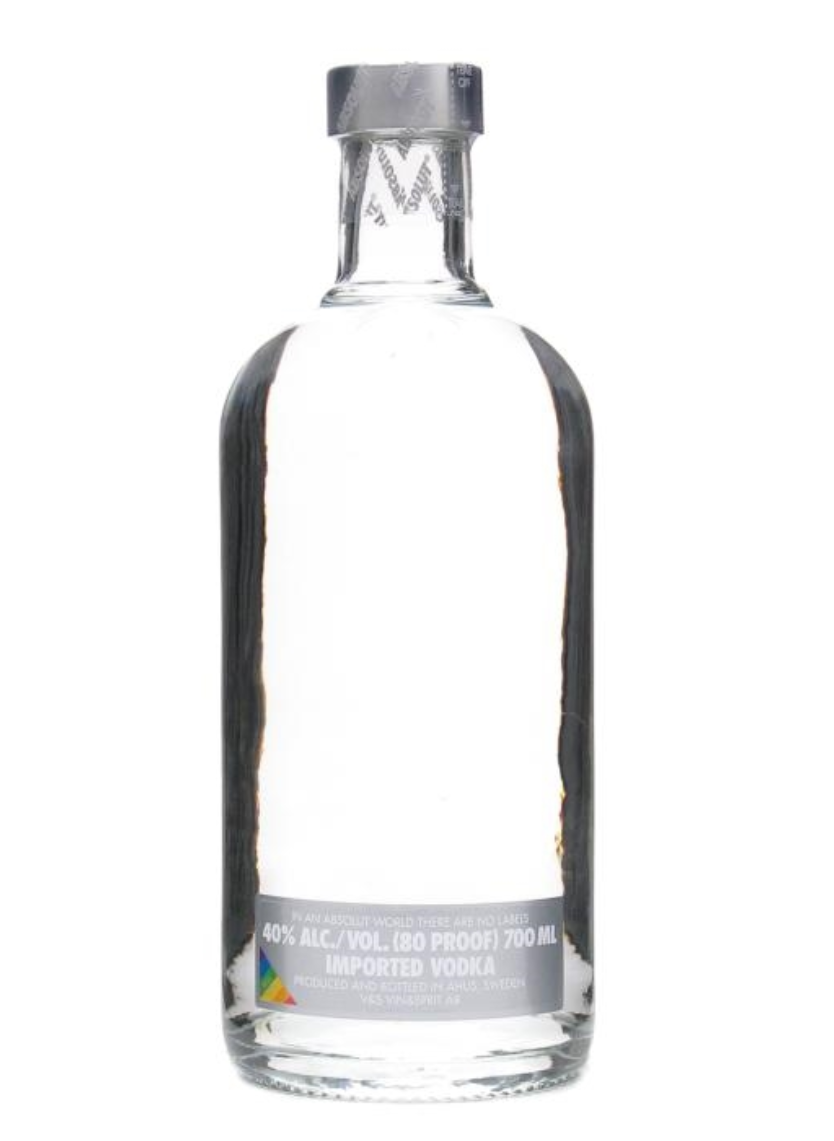
In 2009, major brand, Absolut Vodka, launched an edition of their bottle with no label. The company’s global public relations manager, Kristina Hagbard, explained that “For the first time we dare to face the world completely naked. We launch a bottle with no label and no logo, to manifest the idea that no matter what’s on the outside, it’s the inside that really matters” (Klein, 2010). This is incredibly bold considering the fact that we live in a country so heavily impacted by corporate America, branding, and labels. By the end of the 1990’s, protests began against corporate power (Poyner, n.d.). A graphic of the American flag was created as a protest image for group, Adbusters, in the early 2000s. The flag displayed the logos of corporate America companies such as Disney, Exxon, Cocoa Cola, ABC, Nike, McDonald’s, and so on. While parts of the population continued to protest the politics and control that come with corporate America, and Adbusters continued to protest, several brands took it upon themselves to “de-brand”. For example, following Absolut Vodka’s “label-less” bottle, Starbucks launched an unbranded coffee shop in Seattle nicknamed “stealth Starbucks”. After spending two decades blasting its logo on to 16,000 stores worldwide, Starbucks was now trying to escape its own brand (Klein, 2010). I think it is a testament to just how powerful the imagery, branding, and a logo can be. So much so that by simply removing a label, a company is pulling a huge national PR stunt. For a brand to go “brandless”, they must already have a strong enough brand aesthetic that going incognito works in their favor. Genius PR stunt!
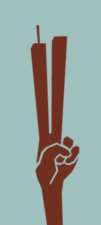
At first glance, this image is so universally powerful. First, we see a hand creating a peace sign to symbolize peace. Then, we see that the first two fingers on the hand have been artistically altered to reference the twin towers. Around the time protests against corporate America began to happen, the American Institute of Graphic Arts (AIGA) started a national design conference called, Voice (Poyner, n.d.). Following the September 11 events in 2001, they chose to cancel the conference; however, they decided to bring it back at a later date and call it Voice 2. The September 11 events provoked a profound need for designers, especially those living in New York, to find a way to use their skills to contribute (Poyner, n.d.). Many designers, both in New York and outside of New York, created images and words to help the public deal with the horrific events. The participants at the Voice 2 conference were incredibly motivated to help society with their designs at a time when America needed it most. I’ve always thought a lot about the word “heroes”, and how that relates to the 9/11 events. When I picture a hero, I picture the stereotype portrayed in movies. I picture strength, knights in shining armor, battle fields, and facing danger head on. Heroes; however, are everywhere and come in all shapes and sizes. The design movement following 9/11 proved just that. Of course, we absolutely identify the first responders during that time as heroes, but we’ve never considered artists. Without designers and artists, we would have no memory of 9/11 in our history books. Nothing to teach the next generation about peace and how horrible things can be, but also how beautiful people can be when they come together to help those in need. The imagery that remains from 9/11 is haunting, universal, and powerful. Just think, without designers, we would never have the new Freedom tower.
Something The Citizen Designer reading allowed me to consider was the term “design”. When I think of what design means, I picture colors, art, graphics, shapes, etc. Webster’s dictionary actually defines the word design as “to create, fashion, execute, or construct according to plan.” When we reconsider all that falls under design, the possibilities are limitless. As a society, we’ve seen a shift to the electronic sphere of design within the last 20-30 years.
“The shift of social transactions to the electronic sphere has the potential to change the conduct of human society as much as the factory system transformed the handicraft traditions that William Morris so adamantly defended.”
(Margolin, n.d.)
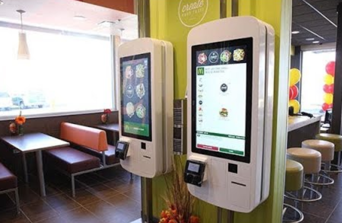
Consumers tend to be the victims of these systems that are created to save large corporations money. How many times have you called Comcast lately and had to dial 0 twenty times to reach the operator, or started getting frustrated because the voice recording wasn’t properly interpreting what you need? Too often. This is what we’re facing as a society, and believe it or not, these new systems are design. The photo I have above shows a self-ordering kiosk at McDonald’s. Somebody not only designed the software, but the look of the system, and then architecturally how the system physically would fit within a McDonald’s restaurant. Design is such a broad term and it surrounds us. Everything we see or touch was designed by someone and has some impact on society. Once we open our minds to this new way of thinking, the world looks a little different.
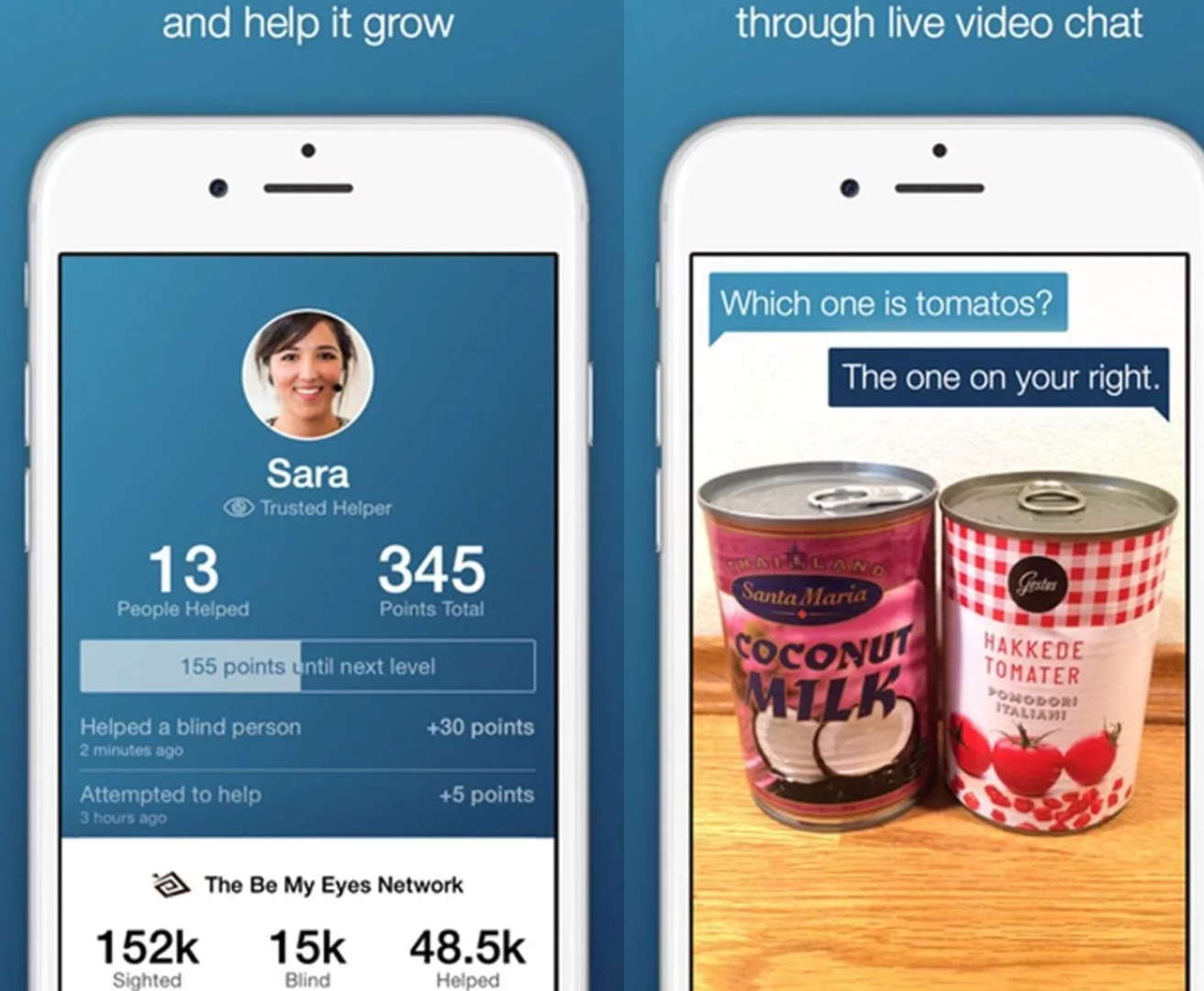
While self-checkout kiosks and automated systems are replacing jobs, there has been much positive change due to digital design as well. The photo shown is of an app that assists those who are blind called, “Be My Eyes”. It allows someone who is visually impaired to make a video call to someone who has their vision and get assistance from that person. They may help with simple tasks like matching a pair of shoes, or determining which can is tomatoes versus coconut milk like the image shown. Thank you to consumer advocates, designers are prompted to create amazing applications like this that benefit society. “Consumer advocates rather than designers have led the charge against companies that engage in unfair labor practices or manufacture products that are unsafe or not inaccessible to all users” (Margolin, n.d.). Again, I did not think of things like the airbag when I thought of the term design, but it was created in response to consumer advocate Ralph Nader’s book Unsafe at Any Speed. In response to social issues and consumer unfairness, designers come up with solutions to major issues.
“How do we live humanely in an age of rapid technological change?”
(Margolin, n.d.)
America is a consumer’s country. We’re surrounded by brand names and logos almost to the point where we don’t even notice anymore. Rather than seeing concert venues with unique names, we’re seeing concert venues with names like “AT&T Stadium” or “T-Mobile Arena”. Even the clothing we wear is a walking advertisement. Men’s polo shirts are commonly known for having a small brand logo stitched on the right side chest pocket. Just from noticing that logo we can assess an individual’s style, taste, class, age, etc. Also, if you’ve shopped in the Target clothing department recently, you would have noticed the t-shirts for men and women representing brands such as Coca Cola, Disney, Marvel, and NASA. The list goes on. We are becoming walking advertisements without even knowing it, or without being paid for it! We have to stop and ask ourselves; Is this a humane life? “Materialism is a significant factor. It drives manufacturing and incorporates a sense of unreasonable entitlement into the design of many products” (Margolin, n.d.).
“How do we feel about city buses and subways that are plastered with advertising for iPods or Target, thus obscuring any civic identity?”
(Margolin, n.d)
Living in a world so consumed by image and brand, we must be self-aware and discover our own thoughts and feelings about a brand rather than have them be forced upon us.
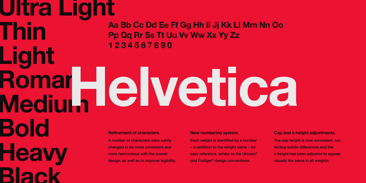
As a communications and marketing professional, selecting typography to reflect a brand is crucial. I found it both fascinating and humorous that as recent as the 1980s, students were hand-drawing fonts like Helvetica, Times, and Bodoni (Blackwell, n.d.). I was also surprised to learn that at that time, getting fonts set on the computer required similar work to html formatting. I remember my first computer in 1999. I was able to type freely with the keyboard, so it is surprising that in such a short amount of years we came so far in technology and digital typography. In the reading, Douglas Coupland speaks about his experience in school with typography. He recalled his teacher exclaiming, “Type is dead! There is nothing more that can ever be done with type” (Blackwell, n.d.). Fast forward to today’s times, and we still have all the fonts that were in existence at that time; however, with new ones continuously being added. We are also now given digital computer programs such as Adobe Illustrator to manipulate typography. In observing the art form of fonts, you must look at how they flow together on the page. The size and space each letter takes up and how bold or thin each letter should be to make the desired statement. Typography is absolutely very much still alive today, and it makes an impact on messaging and creates branding style!
As the Macintosh computer became more popular, it allowed designers to explore new visuals and life boundaries (Heller, n.d.). It enabled entrepreneurial designers to create their own magazine, Emigre. Emigre began in 1984 covering the art of northern California (Heller, n.d.). It was the first of its kind in this new digital age because it was the first graphic design magazine. The magazine was also used to sell and promote typefaces. I was surprised to read this, because I did not know that advertising and selling typefaces was ever a practice!
“Emigre Fonts introduced some of the earliest and quirkiest dot-matrix and, as technology improved, high-resolution digital typefaces.”
(Heller, n.d.)
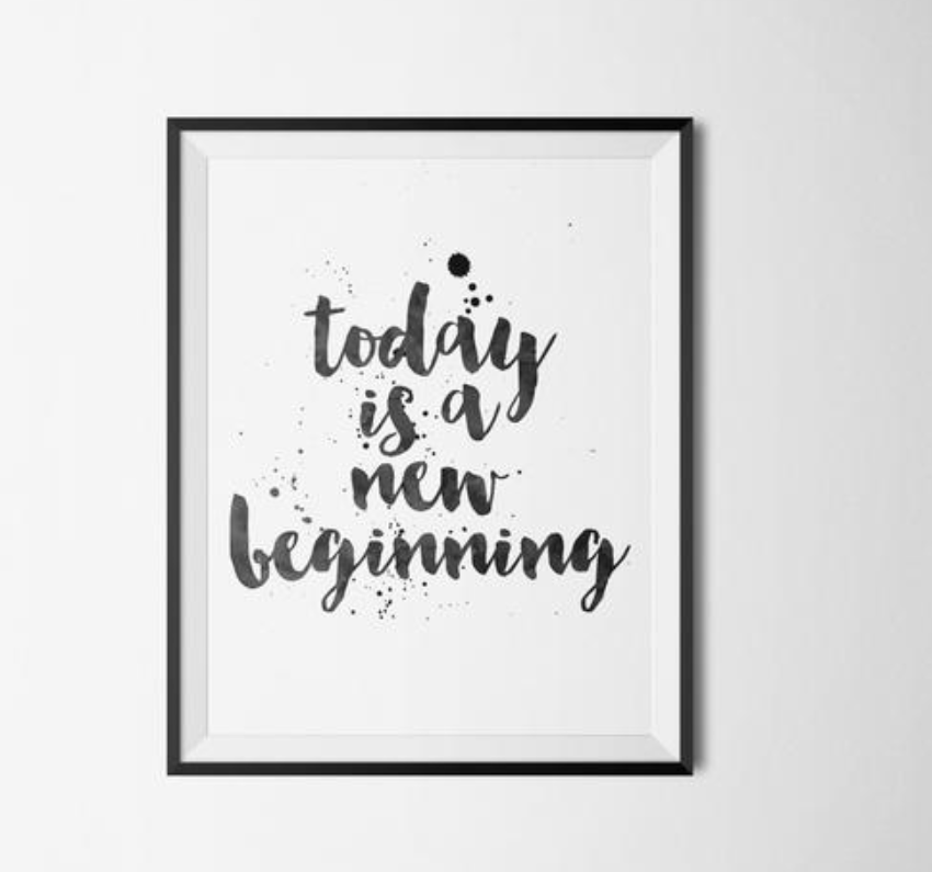
Anti-modernists and student designers also began creating illegible, abstract fragments of pages. While illegible typefonts was a trend in the 80’s, I think we’ve shifted away from that today. Today, typefonts are mostly always legible although they do have some aesthetic inspiration leftover from the illegible phase. Take, for example, typography that has created an entire art wave of quotations just using words like the example shown above. The meaning behind the quotes themselves are art, but also what makes them interesting is the typefonts. This “today is the new beginning” framed quote has elements of the dot matrix and is written in a type font that is legible, but also incorporates some illegible elements. The shape of the letters add to the impact of the words and imagery creating a sense of emotion for the viewer. The work of today’s written quotes are similar to images from Emigre magazine as well where a page may have consisted solely of text with no other imagery.
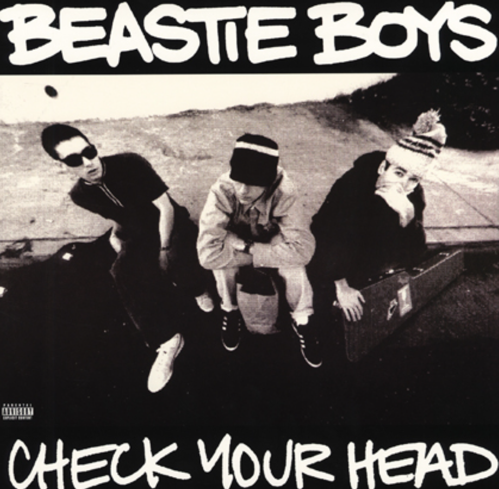
When Ray Gun magazine was published, and David Carson became art director in 1993, he began pushing the envelope (Heller, n.d.) You could tell the magazine was partly founded by a photographer, because it featured a mix of photography and typography. Carson brought his inspiration by playing with typefonts playing with texture. Ray Gun also featured musicians on the cover. Around this same time, 90’s alternative rock and grunge music were becoming popular to the music scene. The new digital age of design inspired album cover after album cover. The ability to mix photography, graphic illustrations, and creative typefonts allowed for much creative freedom and branding for musicians looking to push the envelope with their own album covers.
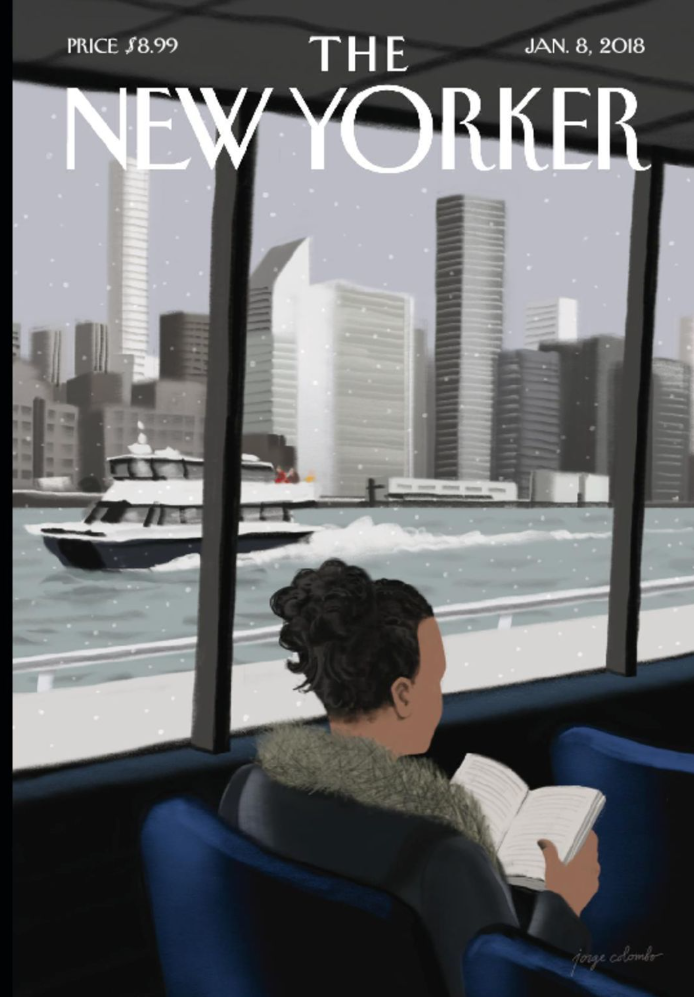
While magazine covers and art certainly have evolved today, they still possess much similarity to the art in the beginnings of the digital age in the 1980s. There are specific elements, like typefaces, that will always exist on magazine covers to spell out a message; however, we have shifted away from illegible type fonts today. Much like Ray Gun, or Emigre magazine, today’s covers still play with color, shape, texture, and photography to create an image. I recently watched a documentary on Netflix about a graphic designer who works on The New Yorker’s magazine covers. The designer explained how with every new cover, he is given the opportunity to create an iconic image that will go down in history. The design process for each cover intrigued me. The designer would first begin laying out the ideas and design with physical objects such as legos or playdough. Next, he would sketch his ideas out on paper. And finally, he would take those inspirations and turn them into a digital work on the computer using a design program.
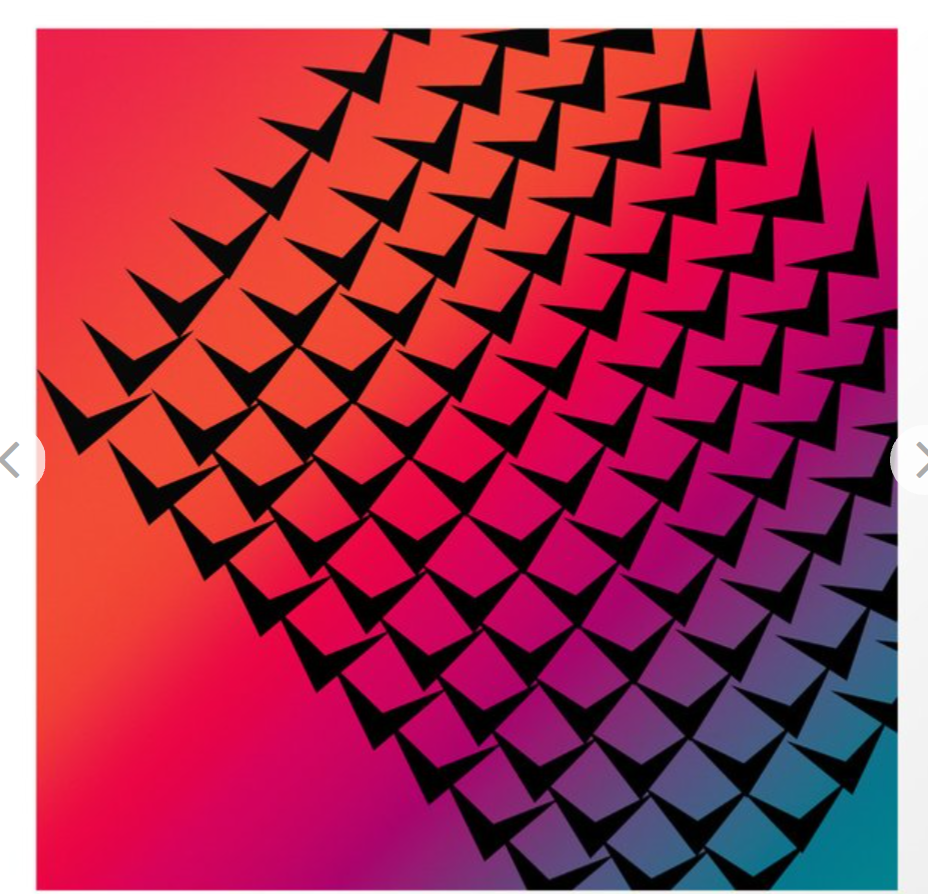
As a society, we are used to seeing colorful, geometric, retro images like this one. When we click to set a new screensaver on our computer, some of the background options may even look like this one. What is retro to us now, was once the start of a new digitally groundbreaking era.
“The influx of technology combined with the development of graphics software had a tremendous impact on graphic design. Within one short decade, the industry had changed forever.”
(Cassette At Work, 2015)
Experimentation with graphic design in the 80’s led to colorful, busy art. We often still see this aesthetic today but do not realize the inspiration comes from the early digital age. Think arcades and game shows like Wheel of Fortune. Vibrant colors and geometric shapes make up the games and the flashing lights draw us in. With advancements in technology allowing us to create movement to accompany the colors, our eyes are trained to expect pops of color and excitement. The introduction of Adobe’s first software and PageMaker in the 80’s allowed designers to change the path of digital art forever (Cassette At Work, 2015).
“These new tools freed up graphic designers to experiment freely and take more risks.”
(Cassette At Work, 2015)
Sources:
Carson, D., & Blackwell, L. (1995). The end of print. München: Bangert.