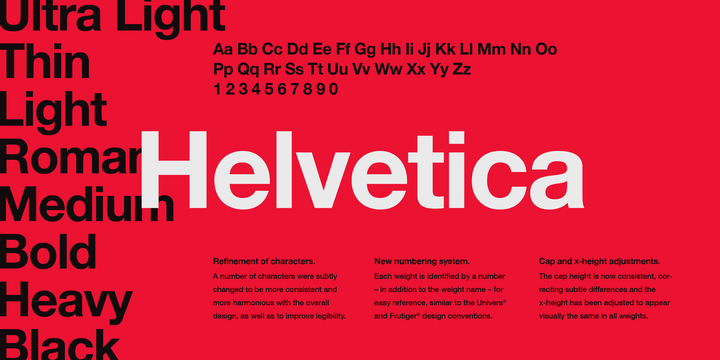
As a communications and marketing professional, selecting typography to reflect a brand is crucial. I found it both fascinating and humorous that as recent as the 1980s, students were hand-drawing fonts like Helvetica, Times, and Bodoni (Blackwell, n.d.). I was also surprised to learn that at that time, getting fonts set on the computer required similar work to html formatting. I remember my first computer in 1999. I was able to type freely with the keyboard, so it is surprising that in such a short amount of years we came so far in technology and digital typography. In the reading, Douglas Coupland speaks about his experience in school with typography. He recalled his teacher exclaiming, “Type is dead! There is nothing more that can ever be done with type” (Blackwell, n.d.). Fast forward to today’s times, and we still have all the fonts that were in existence at that time; however, with new ones continuously being added. We are also now given digital computer programs such as Adobe Illustrator to manipulate typography. In observing the art form of fonts, you must look at how they flow together on the page. The size and space each letter takes up and how bold or thin each letter should be to make the desired statement. Typography is absolutely very much still alive today, and it makes an impact on messaging and creates branding style!
As the Macintosh computer became more popular, it allowed designers to explore new visuals and life boundaries (Heller, n.d.). It enabled entrepreneurial designers to create their own magazine, Emigre. Emigre began in 1984 covering the art of northern California (Heller, n.d.). It was the first of its kind in this new digital age because it was the first graphic design magazine. The magazine was also used to sell and promote typefaces. I was surprised to read this, because I did not know that advertising and selling typefaces was ever a practice!
“Emigre Fonts introduced some of the earliest and quirkiest dot-matrix and, as technology improved, high-resolution digital typefaces.”
(Heller, n.d.)
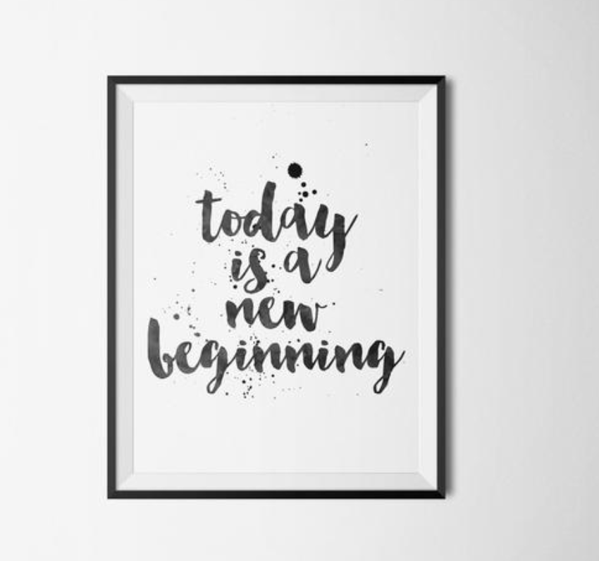
Anti-modernists and student designers also began creating illegible, abstract fragments of pages. While illegible typefonts was a trend in the 80’s, I think we’ve shifted away from that today. Today, typefonts are mostly always legible although they do have some aesthetic inspiration leftover from the illegible phase. Take, for example, typography that has created an entire art wave of quotations just using words like the example shown above. The meaning behind the quotes themselves are art, but also what makes them interesting is the typefonts. This “today is the new beginning” framed quote has elements of the dot matrix and is written in a type font that is legible, but also incorporates some illegible elements. The shape of the letters add to the impact of the words and imagery creating a sense of emotion for the viewer. The work of today’s written quotes are similar to images from Emigre magazine as well where a page may have consisted solely of text with no other imagery.
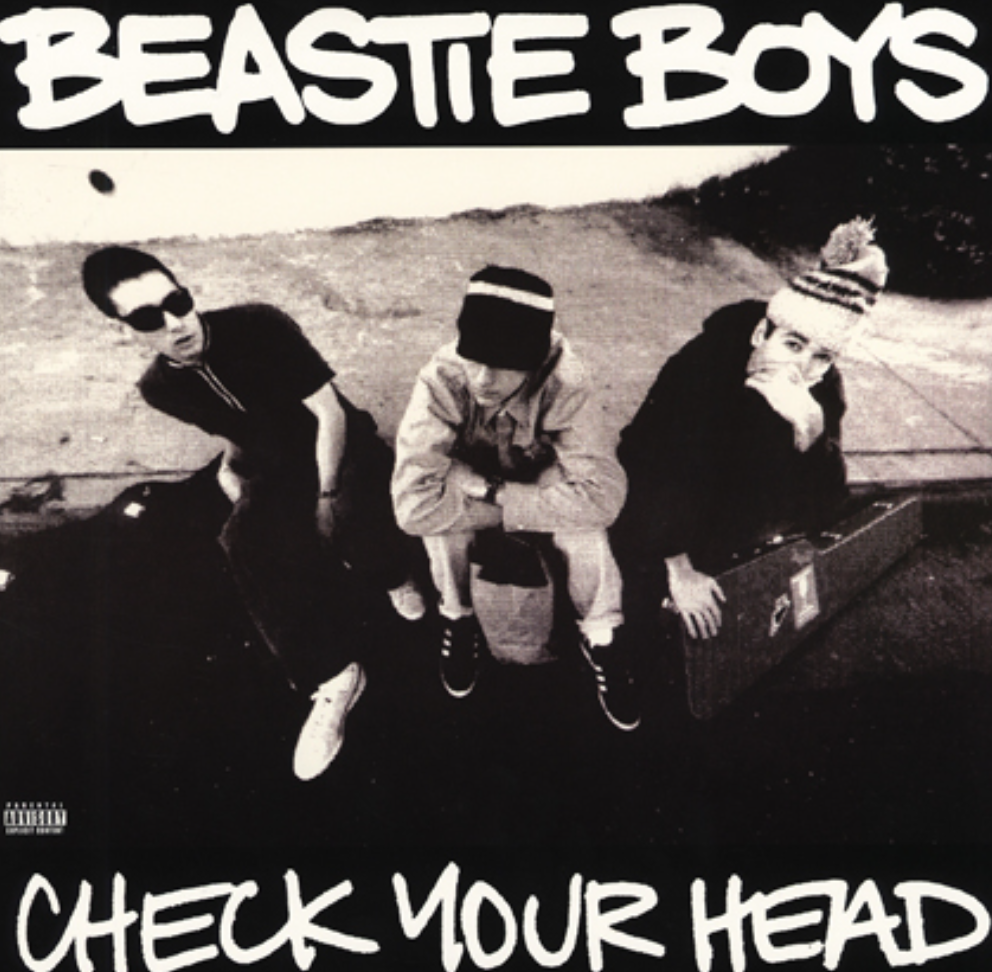
When Ray Gun magazine was published, and David Carson became art director in 1993, he began pushing the envelope (Heller, n.d.) You could tell the magazine was partly founded by a photographer, because it featured a mix of photography and typography. Carson brought his inspiration by playing with typefonts playing with texture. Ray Gun also featured musicians on the cover. Around this same time, 90’s alternative rock and grunge music were becoming popular to the music scene. The new digital age of design inspired album cover after album cover. The ability to mix photography, graphic illustrations, and creative typefonts allowed for much creative freedom and branding for musicians looking to push the envelope with their own album covers.
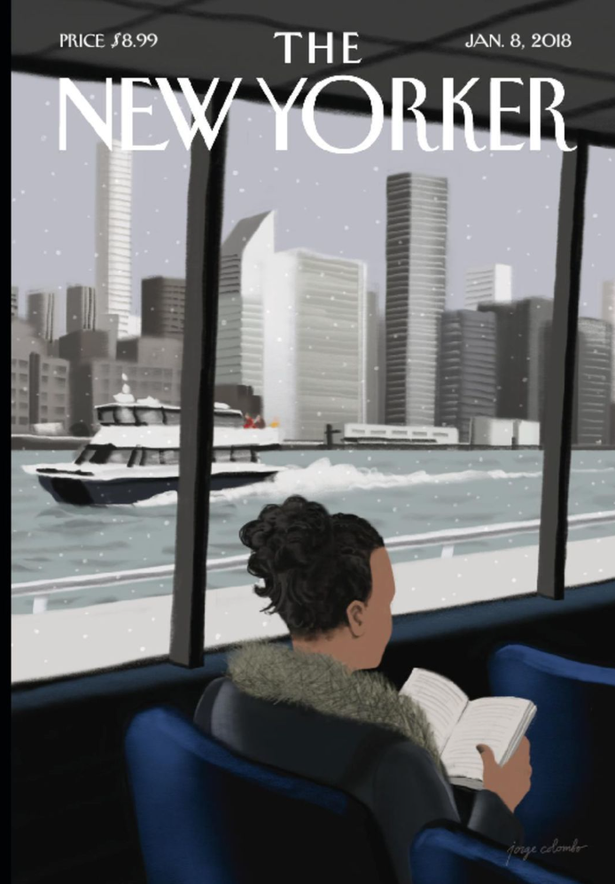
While magazine covers and art certainly have evolved today, they still possess much similarity to the art in the beginnings of the digital age in the 1980s. There are specific elements, like typefaces, that will always exist on magazine covers to spell out a message; however, we have shifted away from illegible type fonts today. Much like Ray Gun, or Emigre magazine, today’s covers still play with color, shape, texture, and photography to create an image. I recently watched a documentary on Netflix about a graphic designer who works on The New Yorker’s magazine covers. The designer explained how with every new cover, he is given the opportunity to create an iconic image that will go down in history. The design process for each cover intrigued me. The designer would first begin laying out the ideas and design with physical objects such as legos or playdough. Next, he would sketch his ideas out on paper. And finally, he would take those inspirations and turn them into a digital work on the computer using a design program.
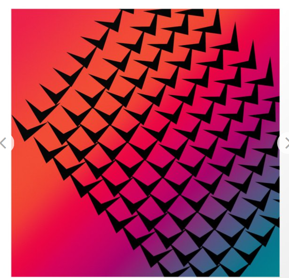
As a society, we are used to seeing colorful, geometric, retro images like this one. When we click to set a new screensaver on our computer, some of the background options may even look like this one. What is retro to us now, was once the start of a new digitally groundbreaking era.
“The influx of technology combined with the development of graphics software had a tremendous impact on graphic design. Within one short decade, the industry had changed forever.”
(Cassette At Work, 2015)
Experimentation with graphic design in the 80’s led to colorful, busy art. We often still see this aesthetic today but do not realize the inspiration comes from the early digital age. Think arcades and game shows like Wheel of Fortune. Vibrant colors and geometric shapes make up the games and the flashing lights draw us in. With advancements in technology allowing us to create movement to accompany the colors, our eyes are trained to expect pops of color and excitement. The introduction of Adobe’s first software and PageMaker in the 80’s allowed designers to change the path of digital art forever (Cassette At Work, 2015).
“These new tools freed up graphic designers to experiment freely and take more risks.”
(Cassette At Work, 2015)
Sources:
Carson, D., & Blackwell, L. (1995). The end of print. München: Bangert.
Cassette At Work. (n.d.). Retrieved from http://www.cassetteprint.com.au/blog/tips/technology-vs-art-graphic-design-of-the-1980s/
Heller, S. (2014). Merz to Emigre and beyond: Avant-garde magazine design of the twentieth century. London: Phaidon.
