
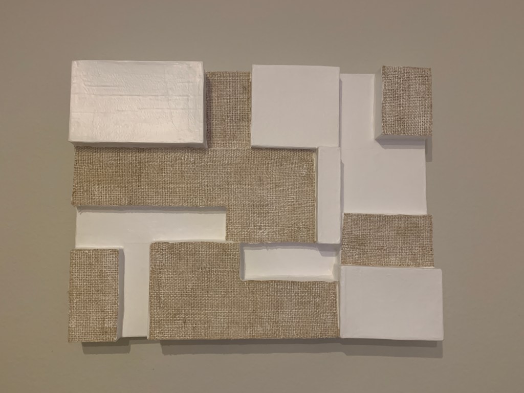
The shapes and forms of Roman serifs defied mathematical analysis or geometrical construction (Alphabets, n.d.). This thought certainly drew me to a piece of art that sits in my own home. With the texture of paper mache and shiplap, this piece is what in today’s world we consider modern art; however, it contains elements that date back to 190 BCE. I wonder, was the artist, in fact, inspired by the early Latin alphabet, or has art evolved from that point in time keeping some of its most sacred and early elements? Typography has changed a lot through the years, but it always existed. In the 1960’s, letters began to look more dynamic and psychedelic. Then, in the 80’s, typesetters stored electronic data and futuristic and colorful letters were used in art and public displays (Smirna, 2017). So, like the fashion world where old trends come back in style (I bought a pair of bell-bottom jeans this year), has ancient typography come back in style? Is the art in my home inspired by early Latin lettering? To the modern-day human being, ancient Latin letters just appear to be meaningless shapes, but to the people of that time period, it was their language. It was their expression. Is there more behind today’s paper mache and shiplap modern-art? Is there meaning?
“I would venture to warn against too great intimacy with artists as it is very seductive and a little dangerous.”
-Queen Victoria
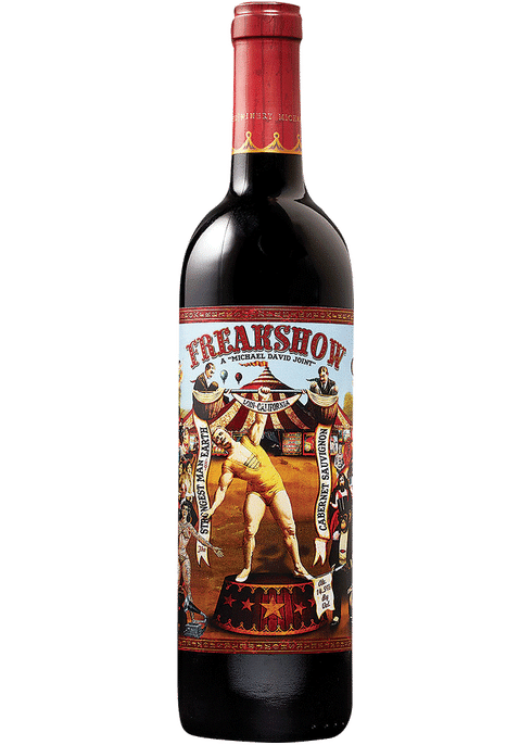
The term Victorian design was coined by Queen Victoria herself and became popular in the later half of the 19th century (Ryan & Conover, n.d.). Victorian style text was found in paintings, architecture, print, furniture, and typography. The Victorian style was said to be eclectic, but timeless and still popular today. Enter, wine bottle. I’ve always admired Michael David’s Freakshow wine bottle on the shelf. I would describe the bottle as whimsical, but I never knew the writing on the bottle’s label was actually Victorian inspired typography. The reading, Connecting Past Legacies, talks about a piece of art titled, “El Circo”, which is doubly influenced: a Victorian typesetting paired with a circus design (Ryan & Conover, n.d.). The Freakshow wine label has the same combination of circus theme and Victorian typesetting influence. The label communicates to wine enthusiasts who are looking for an experience. The label is the first impression, not the taste. The artwork makes a statement that this bottle of wine is something classic, yet it has a whimsical twist. A story in a bottle expressed through the art on the label.
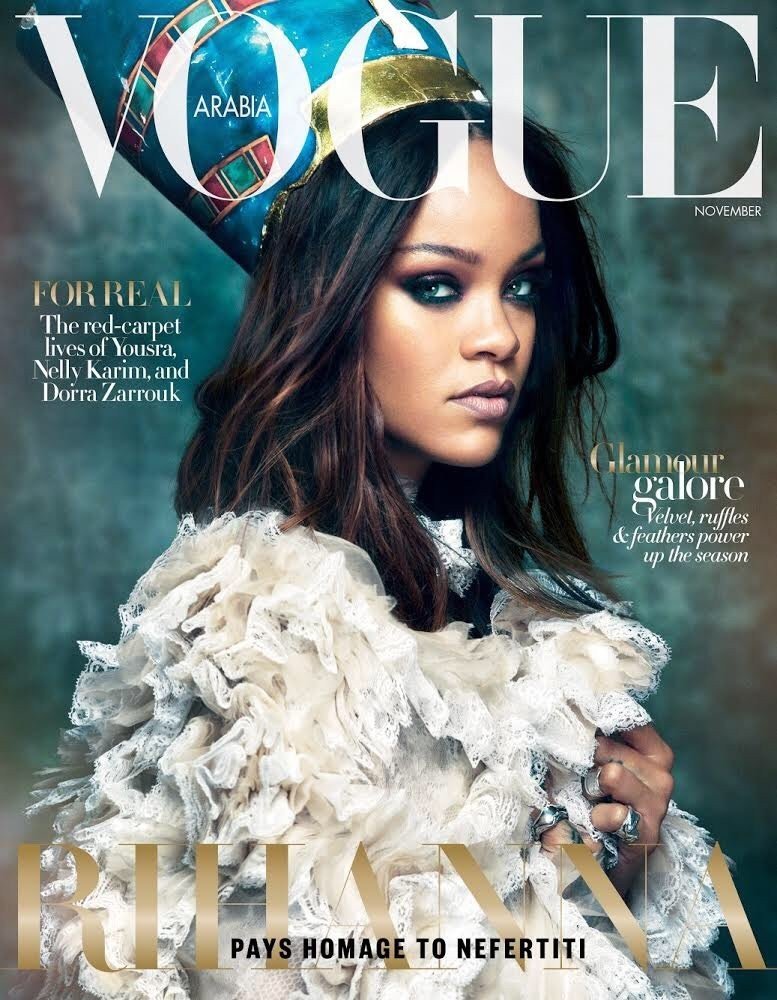
In 2017, singer Rihanna graced the cover of Vogue Arabia in none other than a traditional Egyptian inspired look. Around 1500 BC, the Egyptians evolved their hieroglyphics . Much progress was made at that time going from cave drawings to symbols that represented thoughts or ideas (Ryan & Conover, n.d.). Rihanna’s traditional Egyptian style hat on this vogue cover is recognizable and symbolic dating back to the times of evolving hieroglyphics. Ancient hieroglyphics were said to grace jewelry, architecture, tools, artifacts and more. Today, we are quite the opposite. Rather than engraving tools or artifacts with symbols that were often shown in hieroglyphics, we wear the symbols and create Egyptian inspired art and history with our fashion.
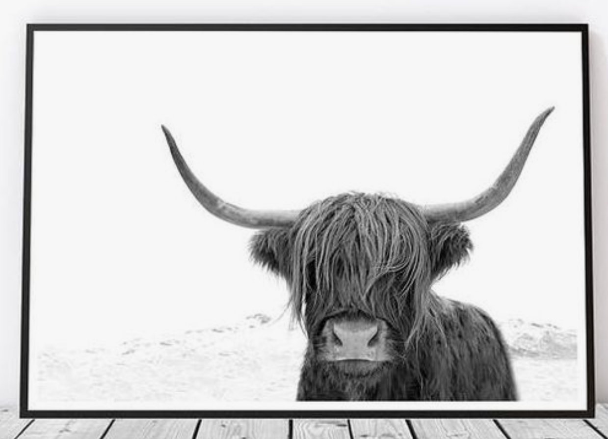
If you’ve been to a home decor store or shopped for home decor online recently, then you may have undoubtedly noticed that pictures of cows, moose, and buffalo are quite in style.
“Prehistoric cave paintings are the earliest examples of human communication available to us and perhaps mark the first emerging of fine and applied art.”
(Ryan and Conover, n.d.)
When I think of early cave paintings, I think of animal figures, human figures, hunters, and storytelling in a progression through imagery. Fast forward to 2019, add computer design, photography, and printers, and there you have modern day cave art. For sale as in-style art for your home! Like traditional cave paintings, this example of modern buffalo art also tells a story. The buffalo is isolated in the frame, standing in a cold climate, and confronting the viewer of the art head on. The art speaks to the animal’s strength and a buyer may purchase the art because they relate to the strength, isolation, and confrontation the art displays. Strength, isolation, and confrontation are not new ideas though. These feelings existed in the times of cave paintings. Cave stories very well could have provoked the same emotion that a buyer in West Elm feels today looking at art like this buffalo example shown.
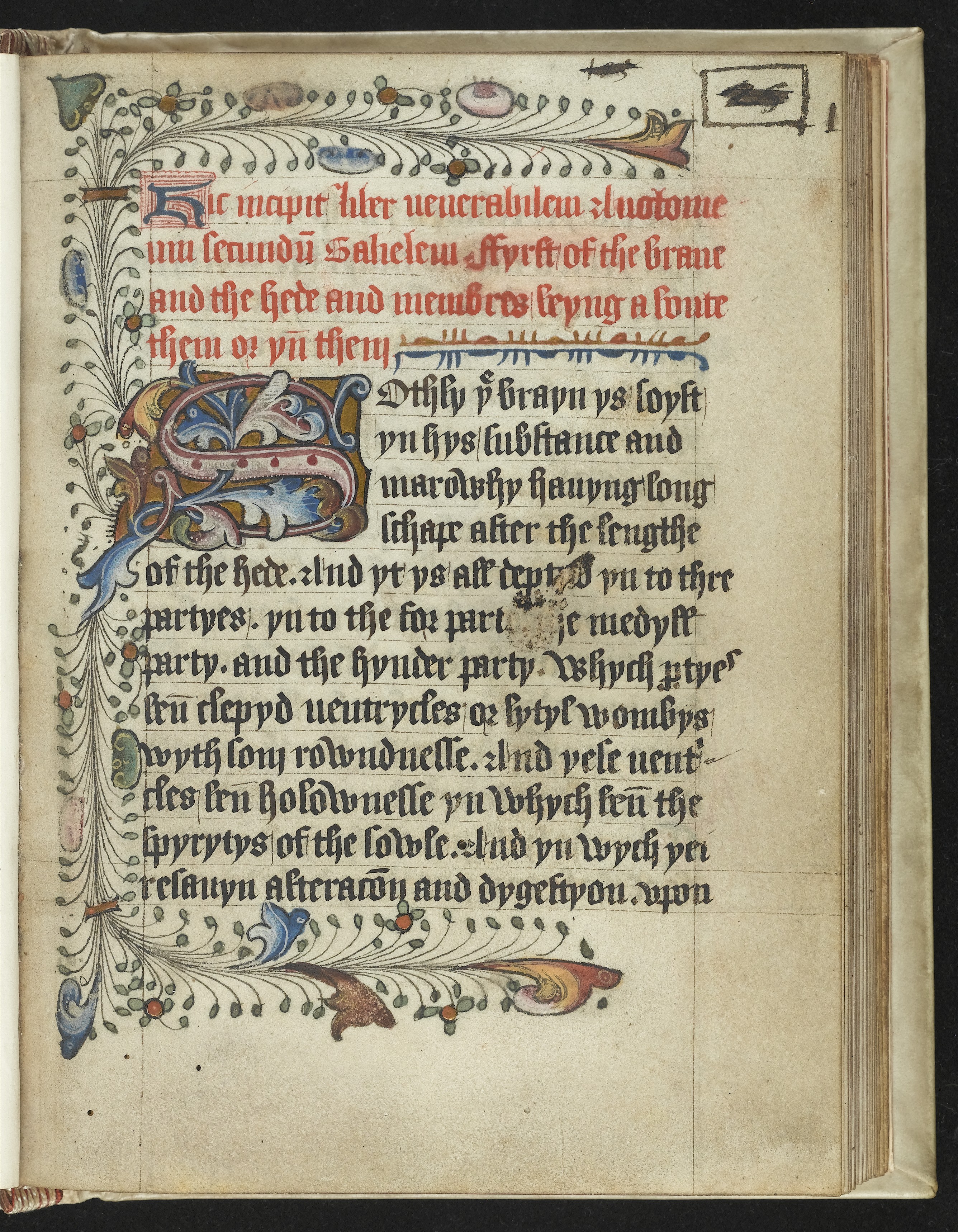
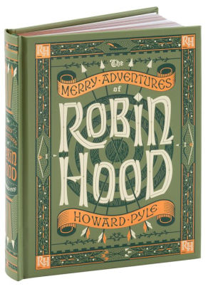
We’ve become accustomed to seeing fairytales and even Disney movies begin by showing a scene of the first page of an old book slowly flipping open. Typically, on that page is a large first initial followed by smaller text like the page example shown above. What we fail to realize is this isn’t a playful design element created by Disney, but one of ancient Celtic book design. The large first initial actually caused design challenge for Monks. Who would have thought, monks sitting around being challenged by artistic design! However, they found a solution called diminuendo, which means to decrease the scale of graphic information (Illuminated Manuscripts, n.d.). Some modern day books, like Robin Hood shown above, are created to resemble ancient books and art. For example, the reading, Illuminated Manuscripts, talks about The Book of Durrow using a large first initial as the page design scheme. Looking at the cover example of that book immediately reminded me of modern day fairytales and Disney books. The designs on ancient Celtic book covers were crafted by a blend of dots, swirls, shapes, and color very similar to what we see today on book covers trying to emulate that ancient feel. Fairytales are timeless and so are the elements of Celtic book design.
Sources:
Illuminated Manuscripts. (n.d.). Religion Past and Present. doi:10.1163/1877-5888_rpp_com_09316
Ryan, W. E., & Conover, T. E. (2004). Graphic communications today. Clifton Park, NY: Thomson/Delmar Learning.
The History of Typography and its Journey Through Art. (n.d.). Retrieved from https://www.widewalls.ch/typography-history-art/
The Latin Alphabet. (n.d.). Alphabets, 31. Retrieved July 3, 2019.
